Design detour on a mid-century dresser
Martha Leone
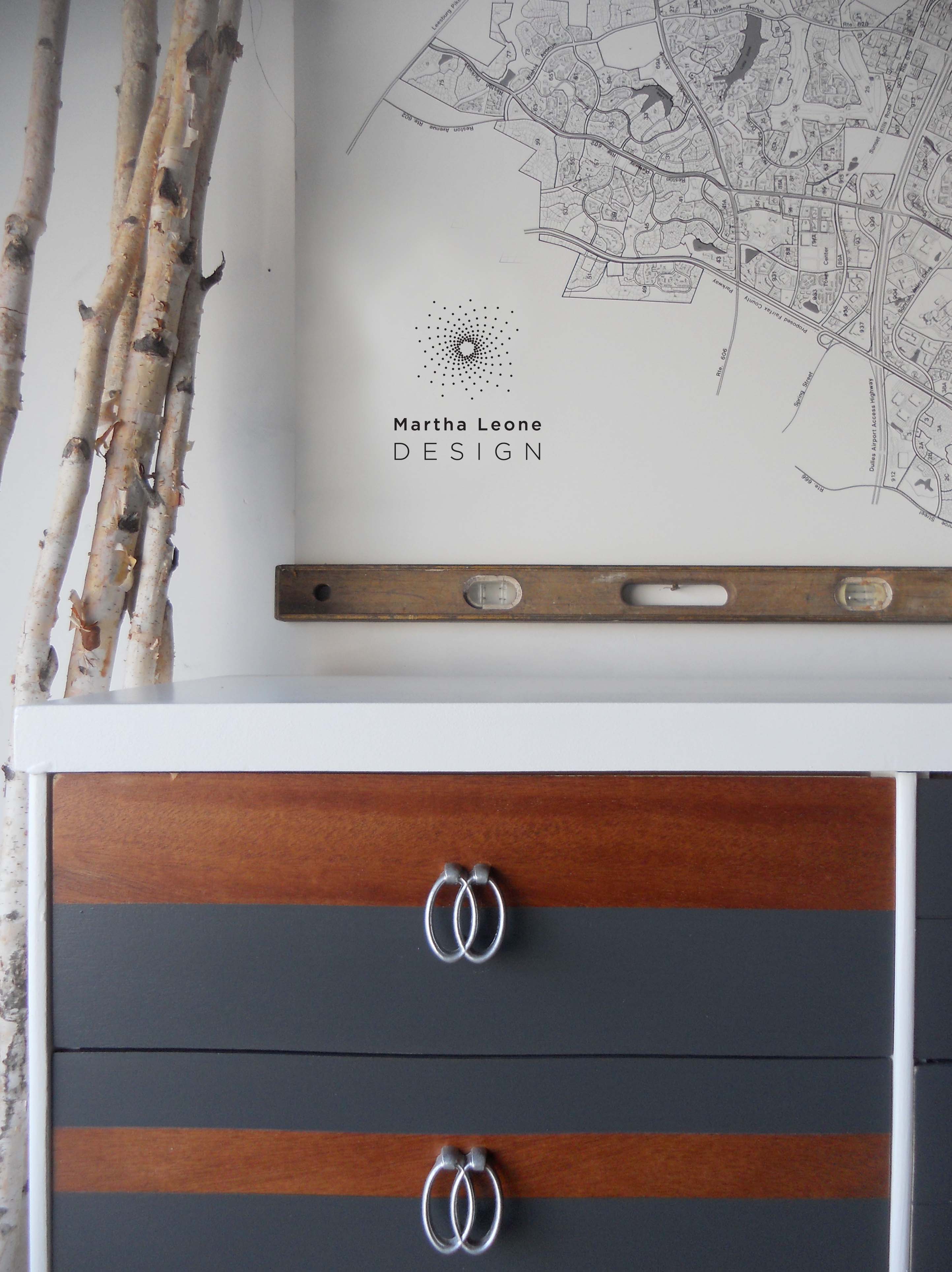
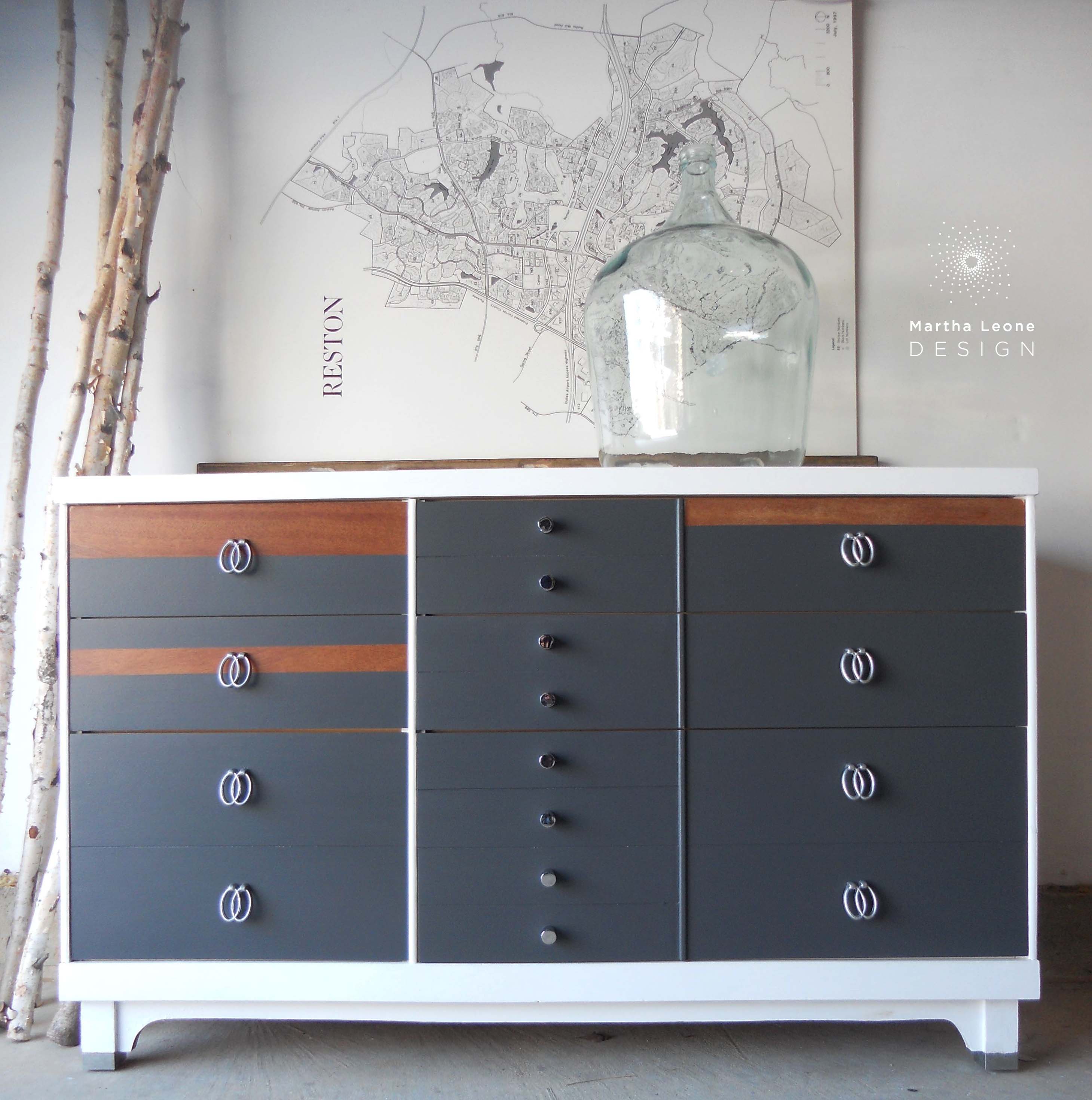
In these extremely cold early days of January, I have been shopping for vintage furniture and planning the next steps for the growth of this small business. Apart from finishing this recent piece, I haven't spent much time in the workshop since before Christmas, and I miss it.
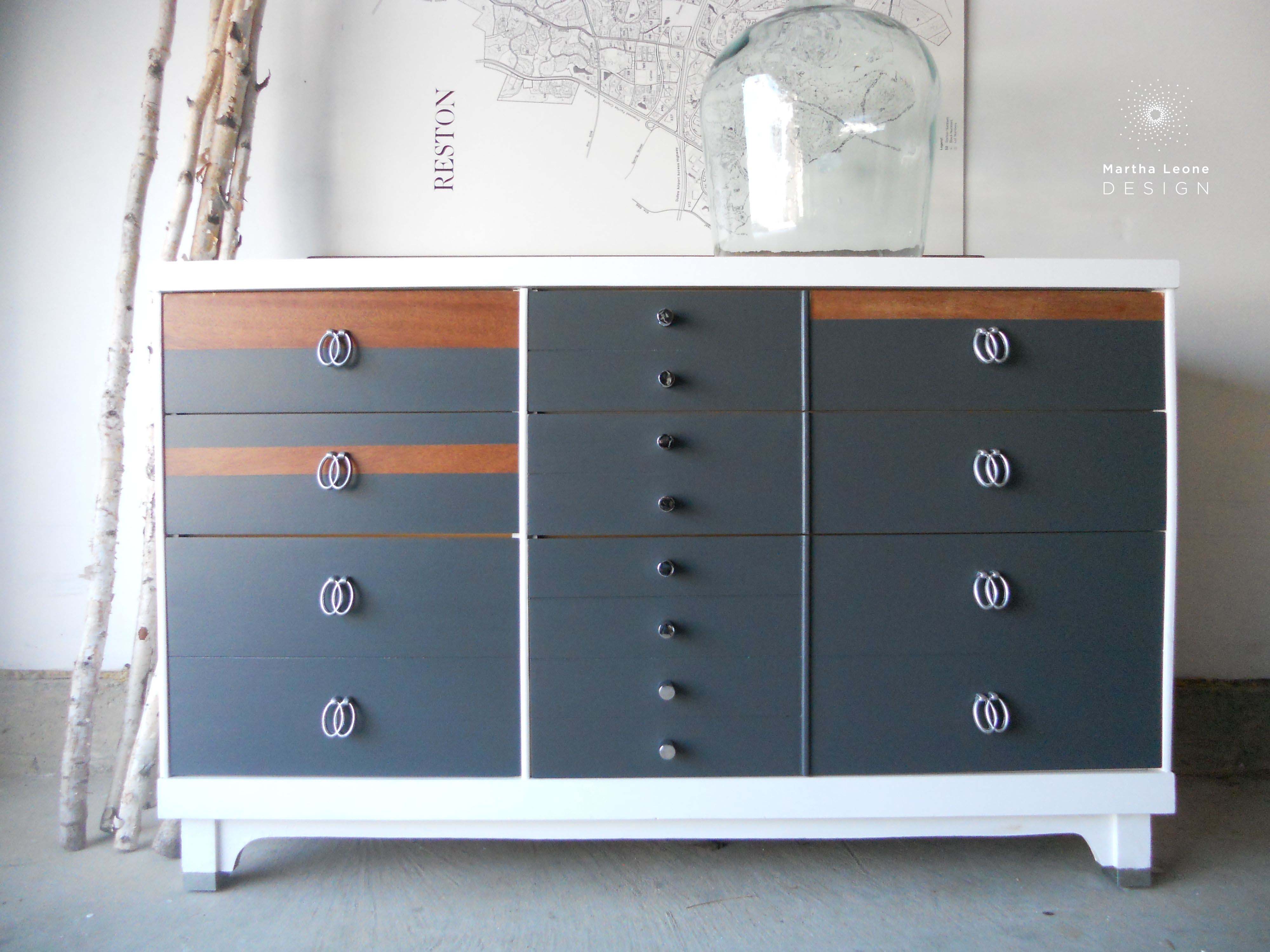
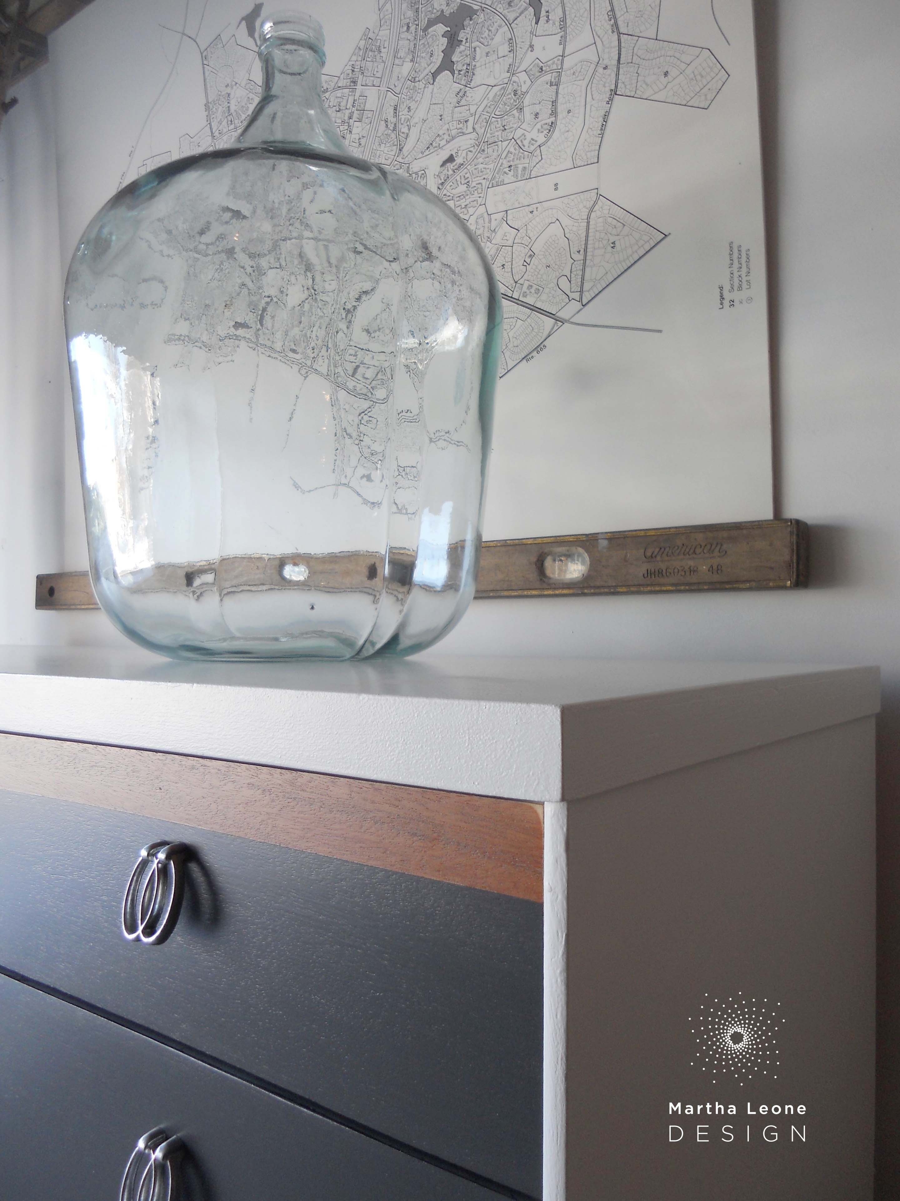
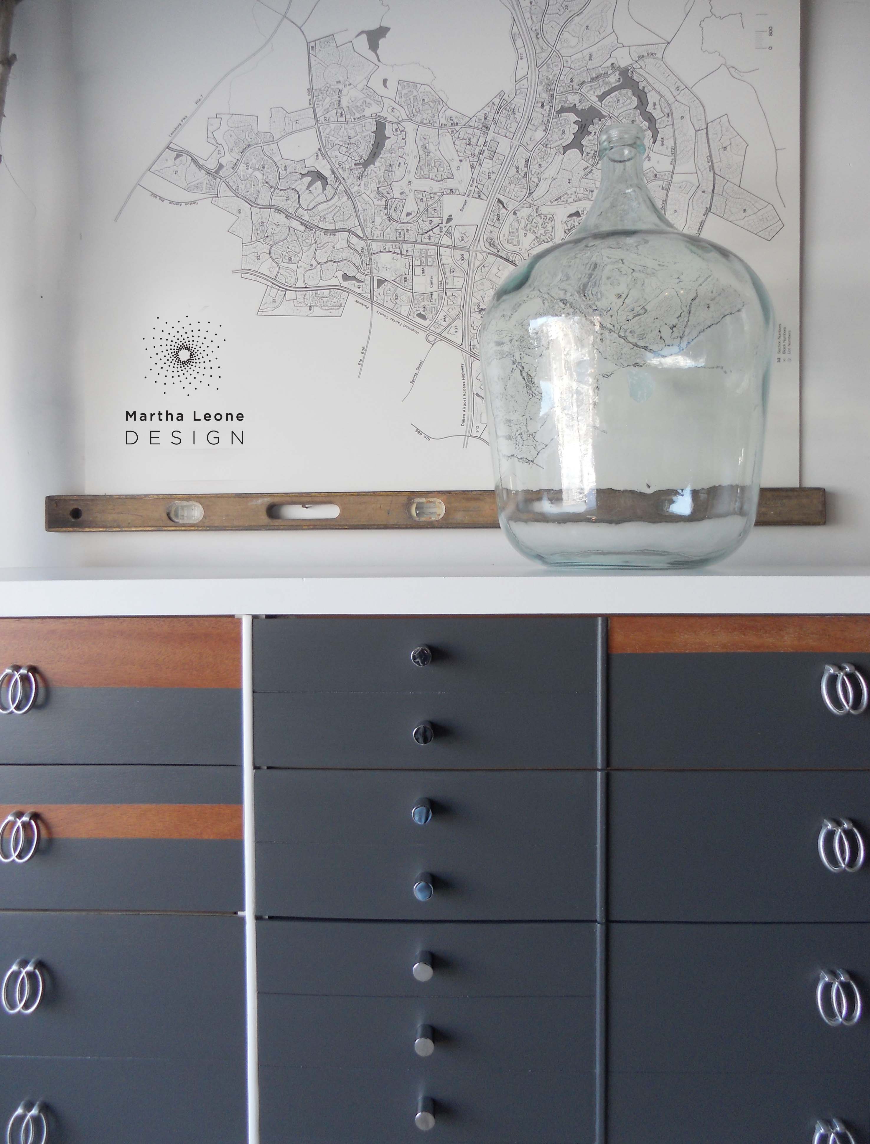
This recent dresser was sanded then painted in versatile colors that will withstand the test of time. I used Benjamin Moore Super White in satin for the outer frame and General Finishes Milk Paint in Queenstown Gray for the drawer fronts.
Although I'm satisfied with the final piece, it went through two design revisions. In this post, I'll explain the problem then the solution. Read a detailed step-by-step on how I paint mid century furniture.
P R O B L E M
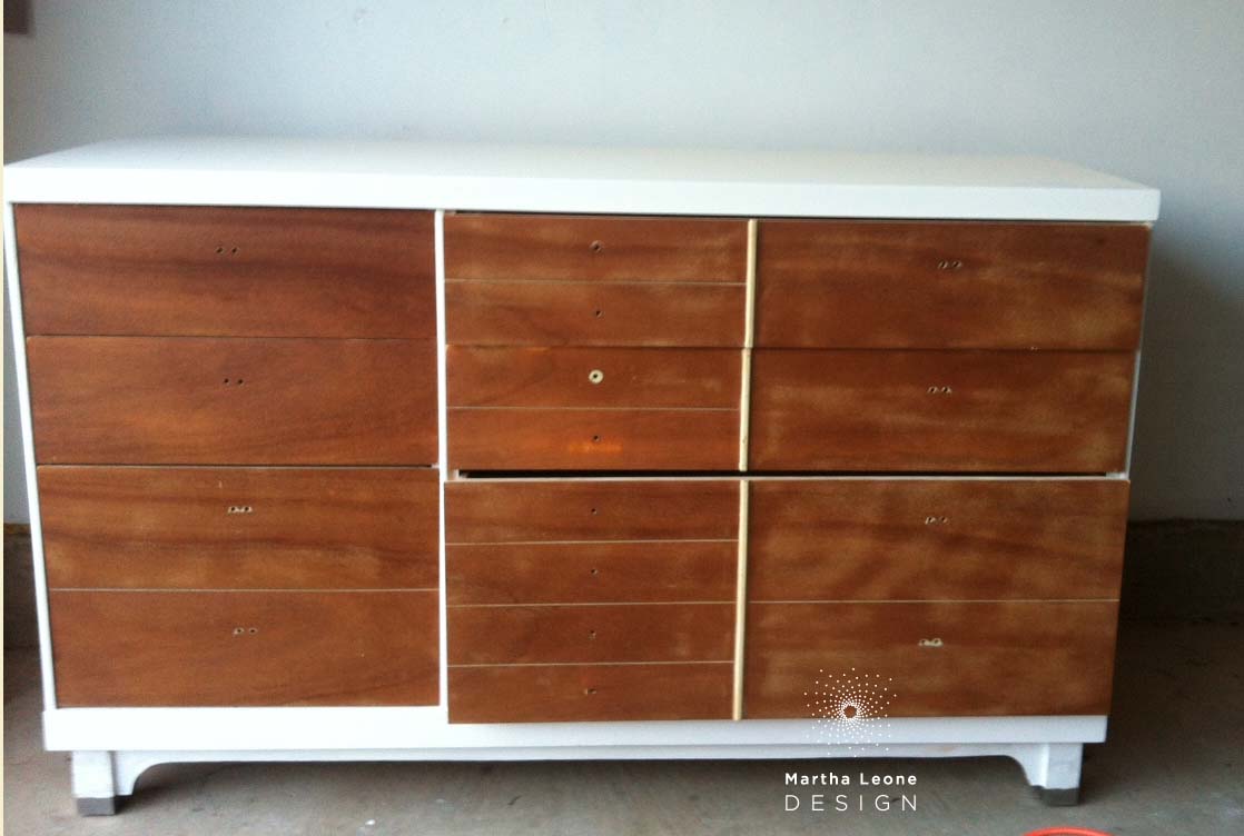
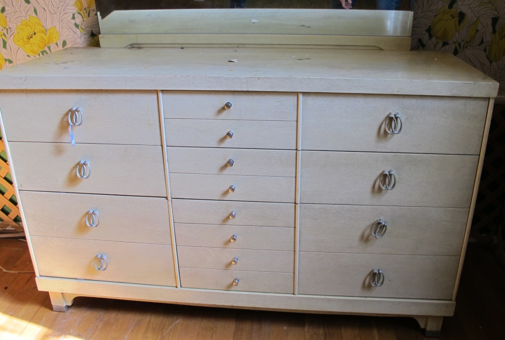
This piece was slated for a customer who wanted the drawer fronts stained and the outer frame painted white. Although I was careful while sanding the drawers, that step proved to be devastating to the exceptionally thin veneer.
S O L U T I O N
Determined to incorporate the natural wood grain in the final design, I used Frog Tape to mask off areas that were not damaged and then covered the other areas with paint. Since the design was driven by the veneer's condition, the outcome was a random asymmetrical layout which didn't work for me although asymmetry is far more compelling than symmetry. The best asymmetrical designs feel random but are ordered and balanced at the same time. This design felt too arbitrary, not balanced. (To get a sense of how symmetry is more preferable than asymmetry, read the comments on one of my dressers that was recently featured on Apartment Therapy.)
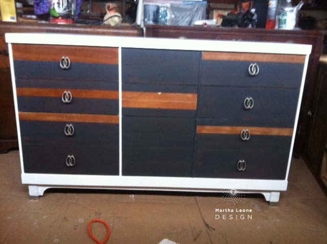
In order to maintain a balanced design and minimize the arbitrary pattern, I "erased" some of the natural wood stripes with paint and ended up with a minimalistic design that worked better:
B E F O R E •• A F T E R

Follow me on Instagram as I share more pictures of how I paint and prep my furniture and get sneak peeks of my approach to styling these pieces for photoshoots.

Linking up: Miss Mustard Seed