Wall Design and a Custom Credenza
Martha Leone
When I style a dresser, the first thing I do is think on the concept then try to incorporate props that reflect the idea. For this dresser, the vertical lines on the three middle drawers influenced the design for the top of the dresser and the artwork on the wall.
// / //
PROCESS • Wall
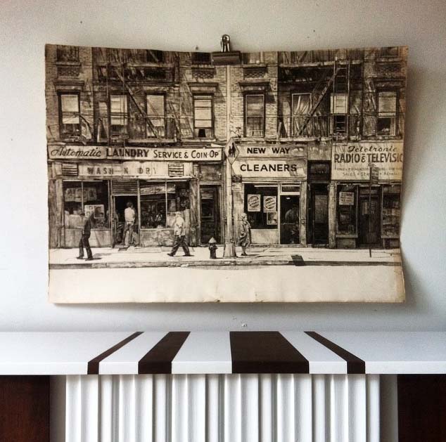
Staging is a process and it doesn't always go as planned. The idea for the shoot was to reflect the bold and simple design of the dresser. I chose this print for the wall but after shooting this test shot, I realized that it had too much detail and texture for this idea.
1. With Frog Tape in hand, I taped a design on the wall with the letter C in mind. After taping it, the C wasn't abstract enough.
2. Broke it up with a couple of horizontal lines.
3. Added two lines. Still not quite right.
4. Connected the two diagonal lines and filled in with paint.
5. Lastly, I used Adobe Photoshop to remove the wall design and like the strength of the simplicity of this shot.
In the end, I decided that the wall design added the right amount of texture and height to the shot so I went with it. Without much effort and just a bit of paint, this dresser was accented by a wall design that reflects its bold lines.
// / //
My tutorial on how I paint mid century furniture details the steps I take with all of my mid century projects.
Linking up: Friday's Furntiuire Link-Up Party/58 Water Street


