Defiant Coco Chair
Martha Leone
 We had an argument and I won... well, maybe it was a draw (referring to the chair and me).
Yikes. What a bother. I had ideas... lots of them but none of them seemed to work for this chair. In my frustration, I began to talk to it, "Hey, you're just a chair. Behave and let's get beyond this project so that I can move on!"
This chair is a prime example of idea block. Ya know what I mean? You have a good idea. It fits well in your mind's eye. It's beautiful, bold, exciting, blah, blah, blah. But in reality, with paint brush in hand Idea and Reality don't get along.
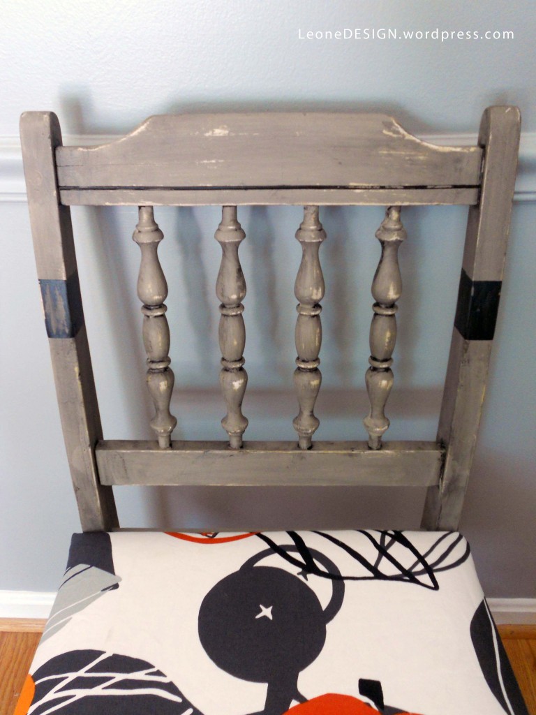
It's painted with a tailored look, but glazed in a haphazard messy way, then topped off with organic contemporary fabric. It's a melting pot of styles and frankly, I'm not sure I like it.
So, let's consider this post a call for an honest critique. How about it? What do you think?
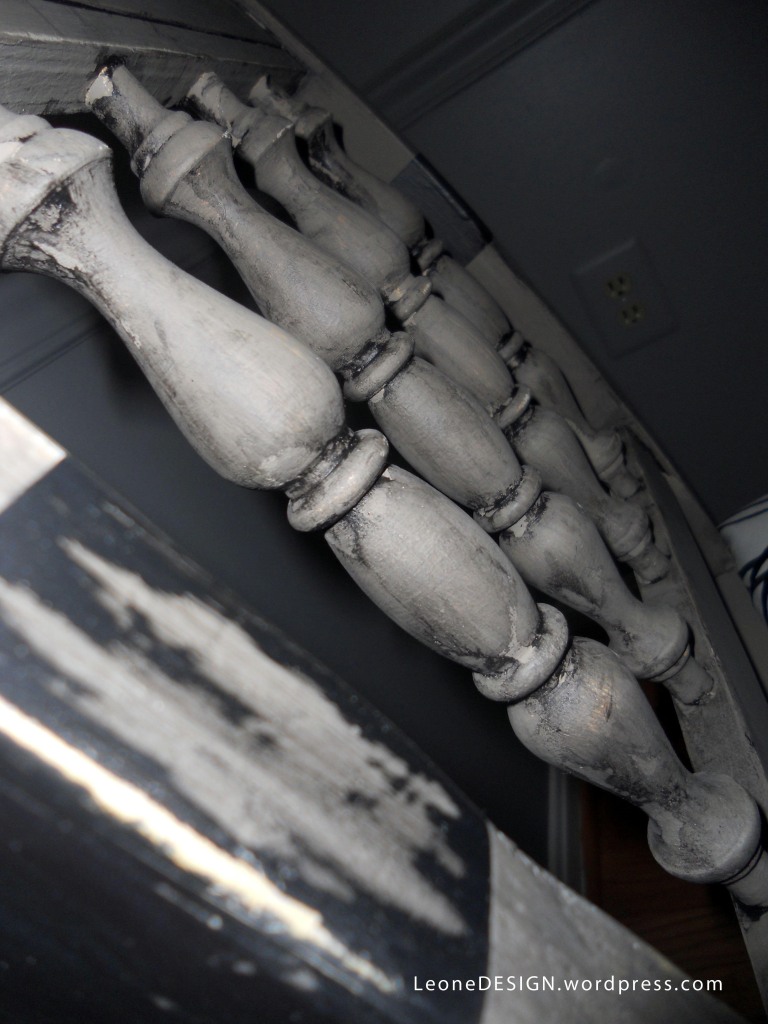
I'm in the process of writing a post on my adventures in using tinted glazes to add texture to furniture. Most people use tinted glazes to give a piece an authentic aged feel. If done well, the glazes do wonders. This chair is not a good example of the process. Instead of using it to age the chair, I kinda used it to add texture and just had fun doing it. I like the "slapped on" look.
Paint: Annie Sloan Coco and a random black color that I had in my stash. Glazed with a black-tinted glaze and lightly distressed.
Lesson Learned: If you're fighting with a piece, either take a break and start over when you have time to tackle it OR finish it quickly! I chose the latter... mom of three needs to get her kids to the pool and summer camps... no time to redo this thing!


