My approach to styling photos
Martha Leone
˚˚˚˚˚˚˚˚˚˚˚˚˚˚˚
Styling can be challenging because I don't have enough stuff sitting around to ensure variety in my photos. So, more often than not, I'll use whatever is laying around as long as the objects support the color scheme I'm trying to pull off in the photo. Achieving a balance between color, shape, and scale are more important than styling a vignette with context or relevance.
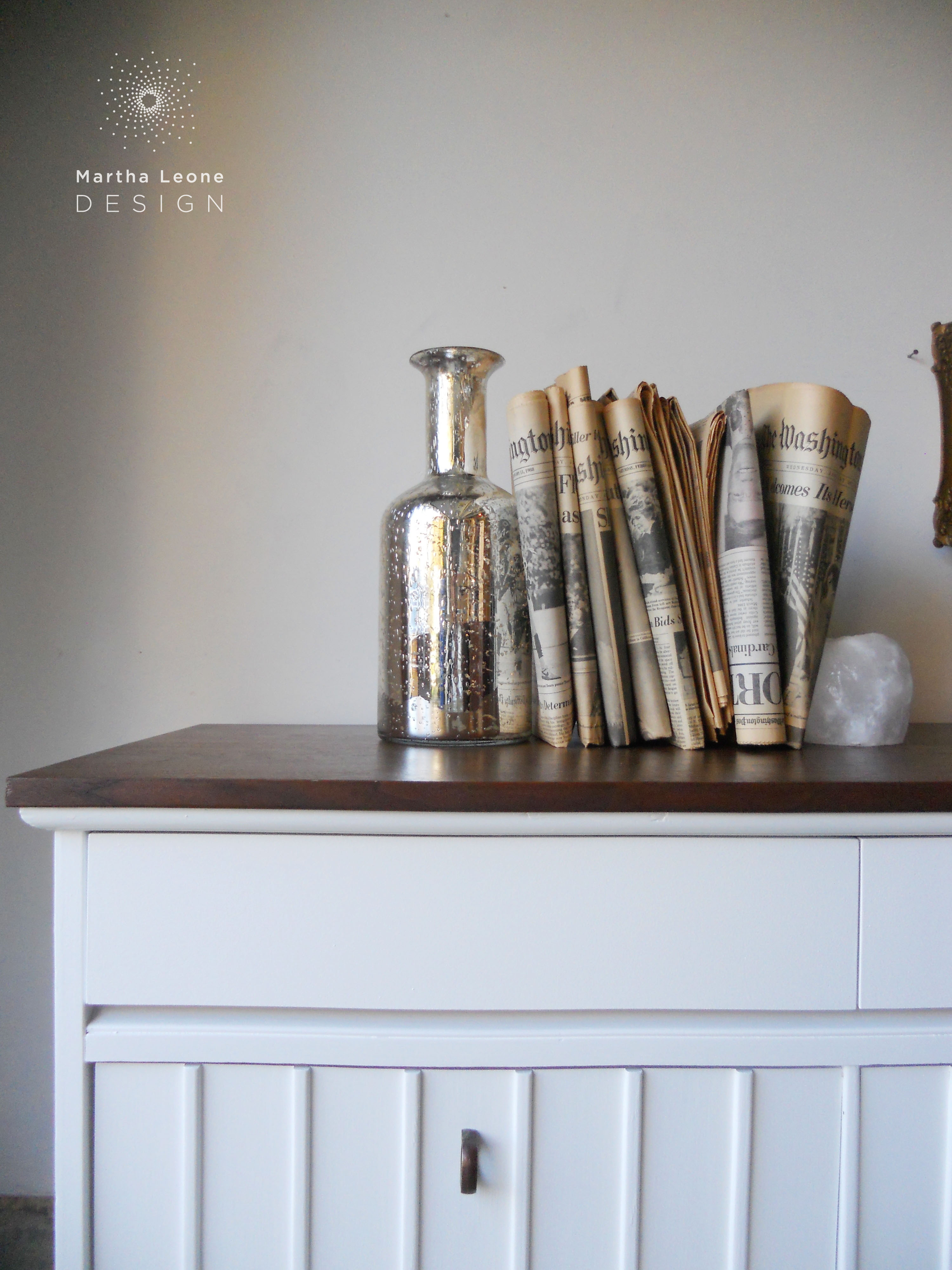
D I X I E D R E S S E R
Shape and texture were the priority in the styling of a recent Dixie dresser. The old newspapers and pictures were found in the bottom drawer of a recently purchased art deco dresser and gave me just enough texture to balance the slick finishes on the piece. I used the old pictures with the slightly ornate frames to balance the straight lines of the Dixie.
˚˚˚˚˚˚˚˚˚˚˚˚˚˚˚
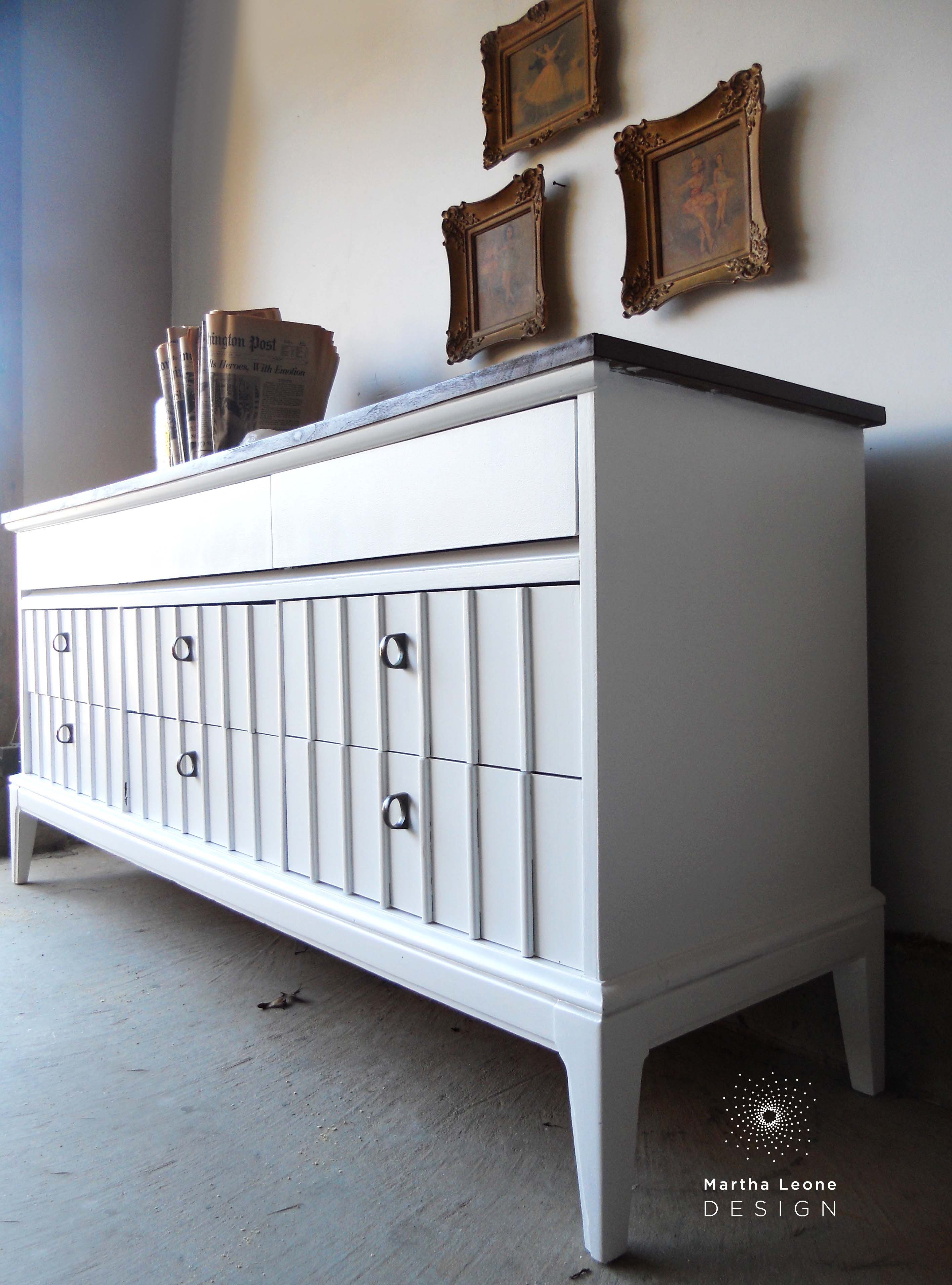
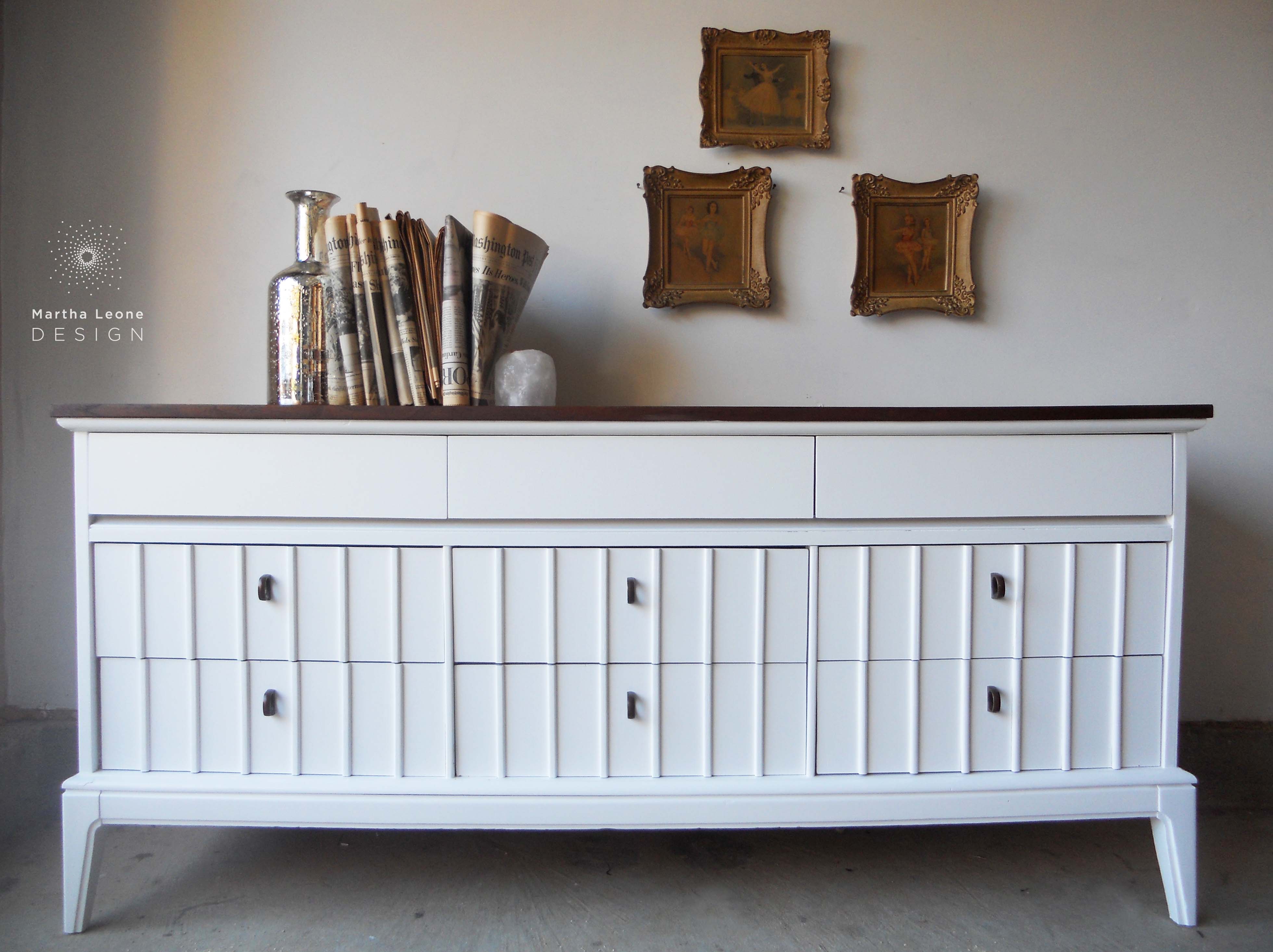
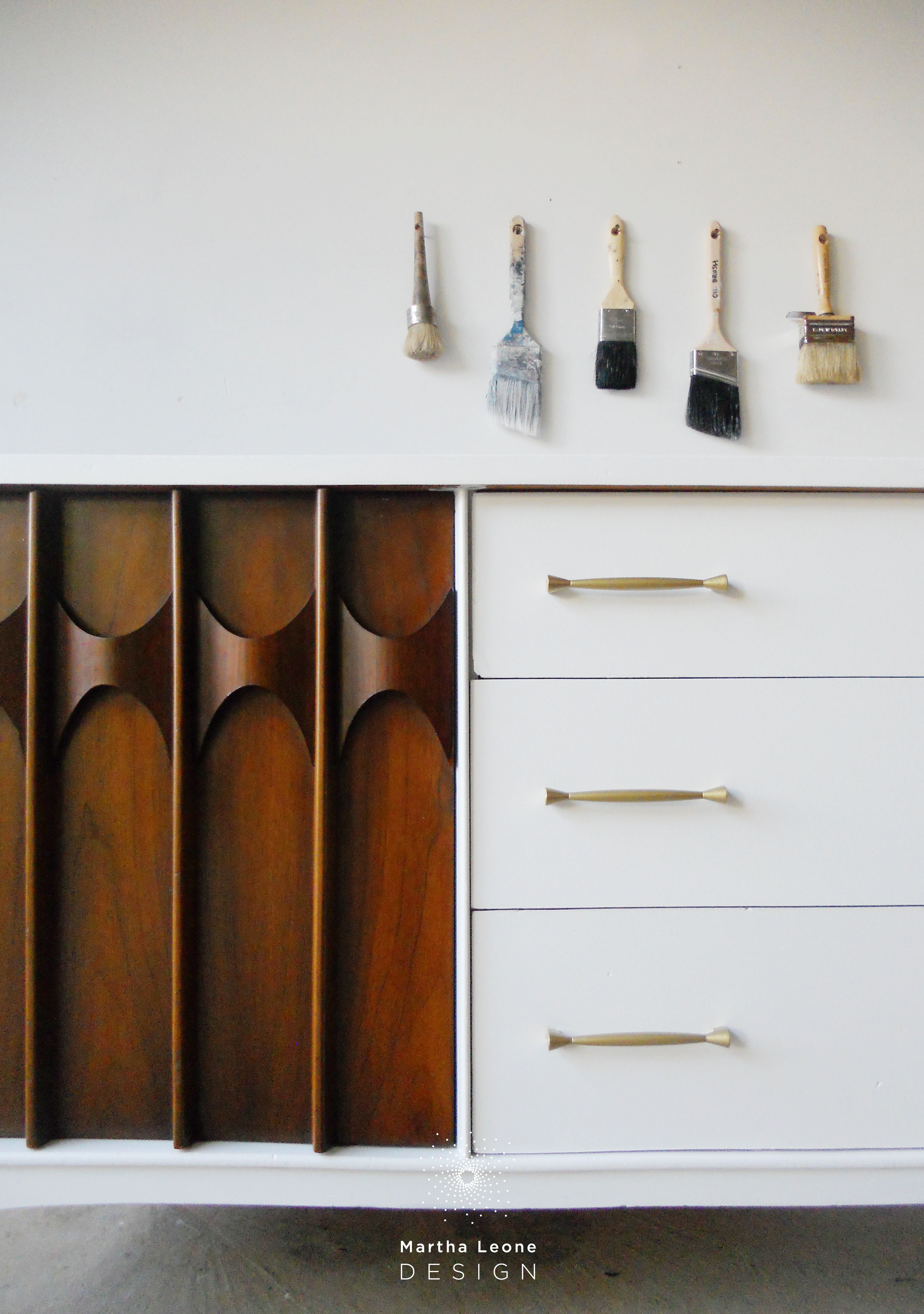
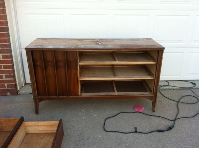
B U F F E T
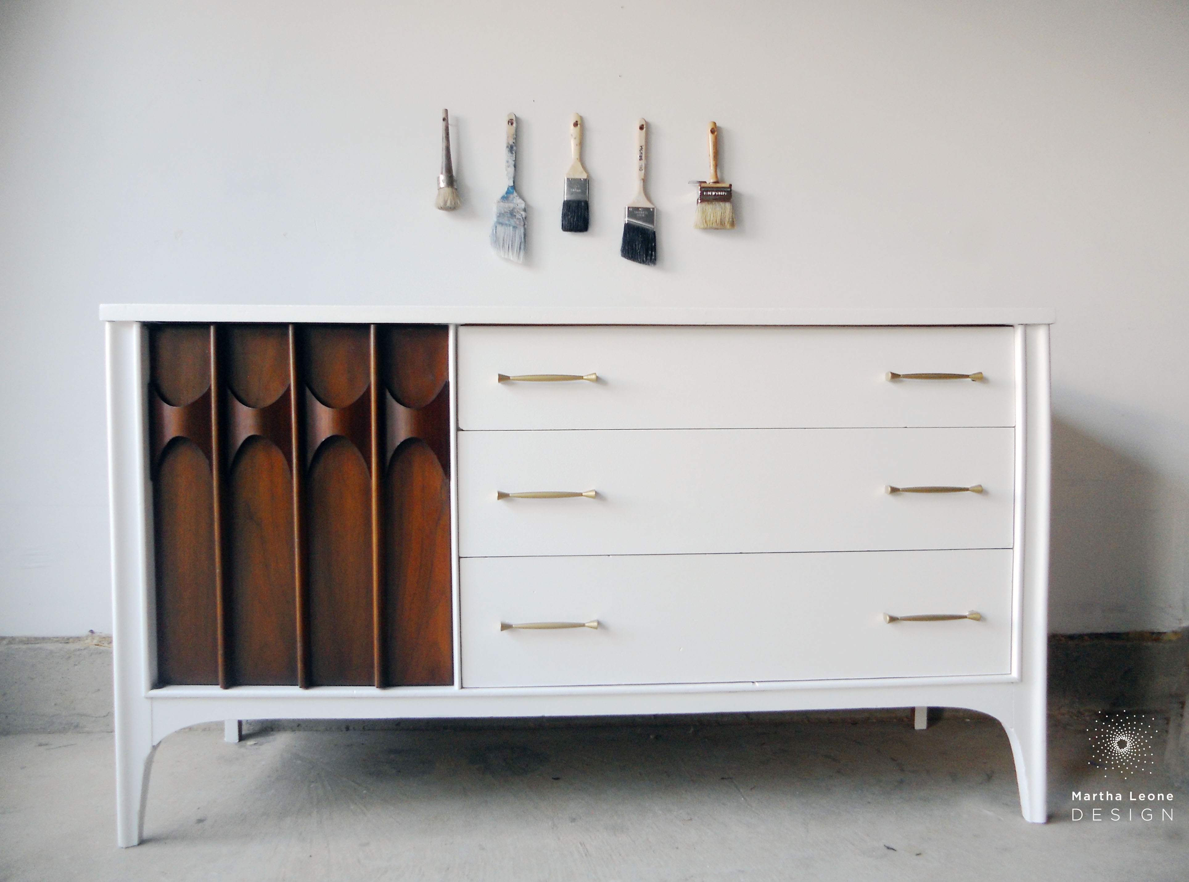
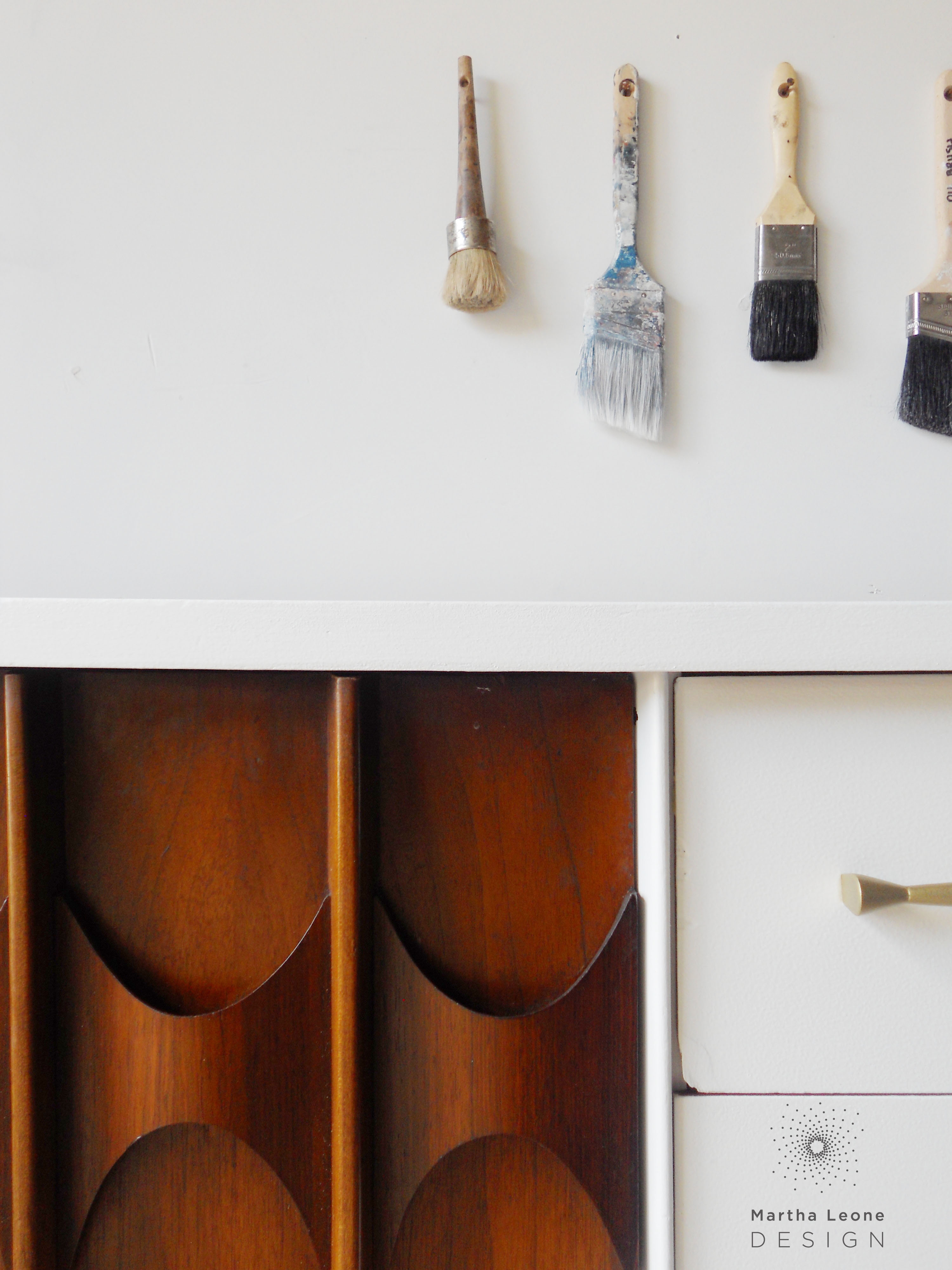
The paint brushes and white wall were chosen for this photoshoot for a couple of reasons: • Shape: The brushes mimic the vertical shapes on the cabinet door. Also, the curved decorative elements and original drawer hardware both taper from wide to thin.
• Keep the color monochromatic: This piece is about shape and line, not color. So adding saturated color would have detracted from the overall design concept.
˚˚˚˚˚˚˚˚˚˚˚˚˚˚˚
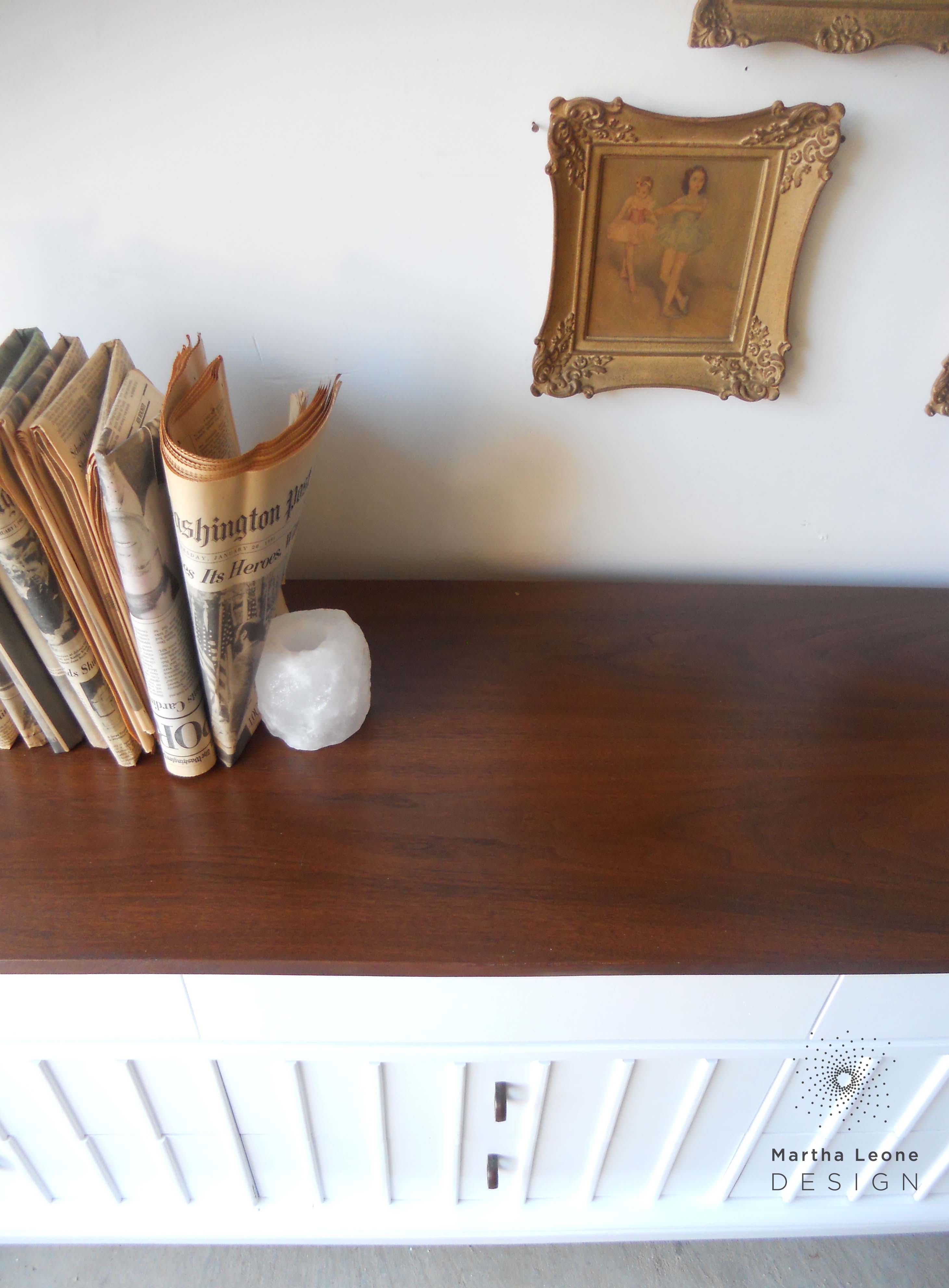
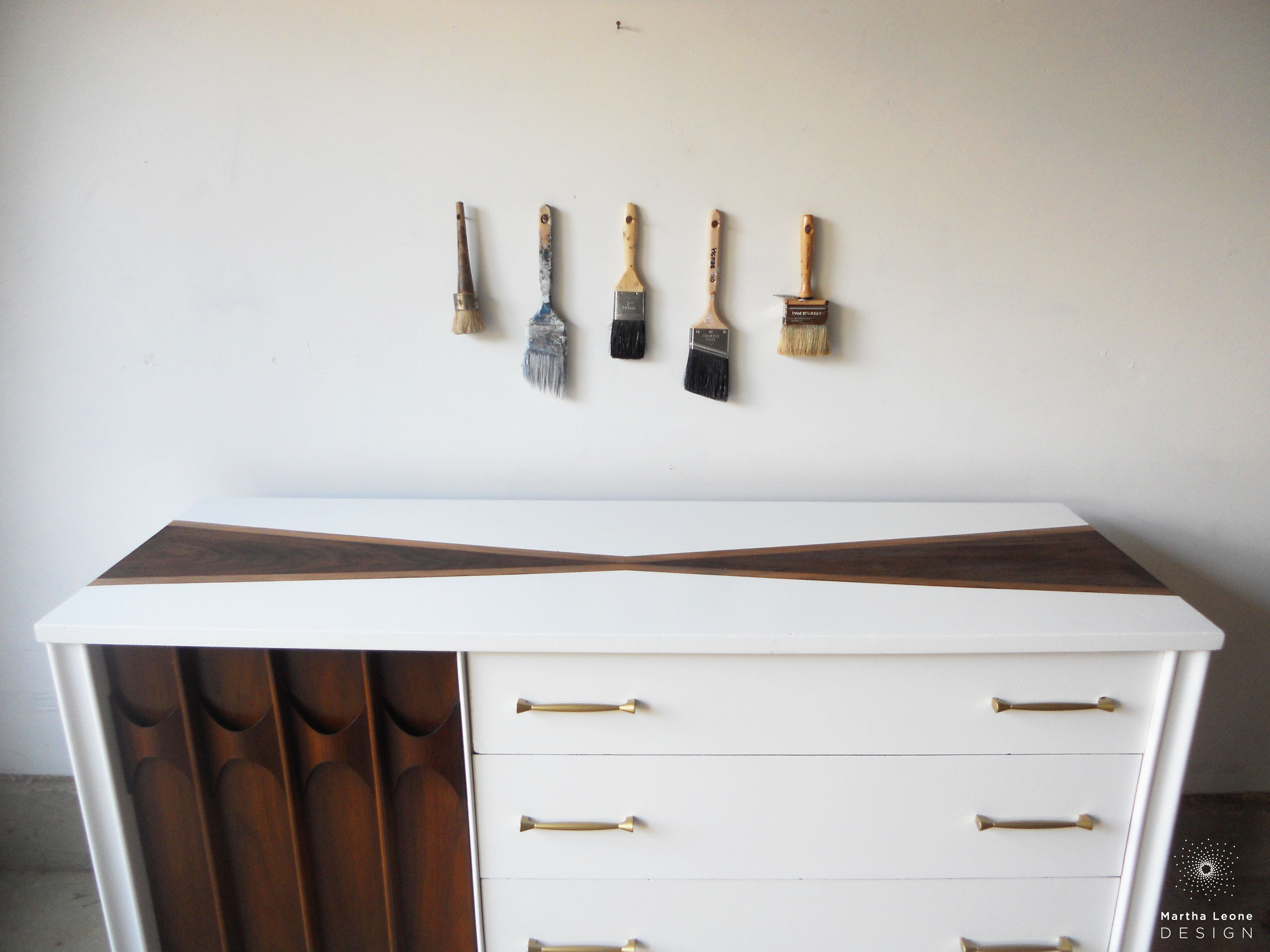
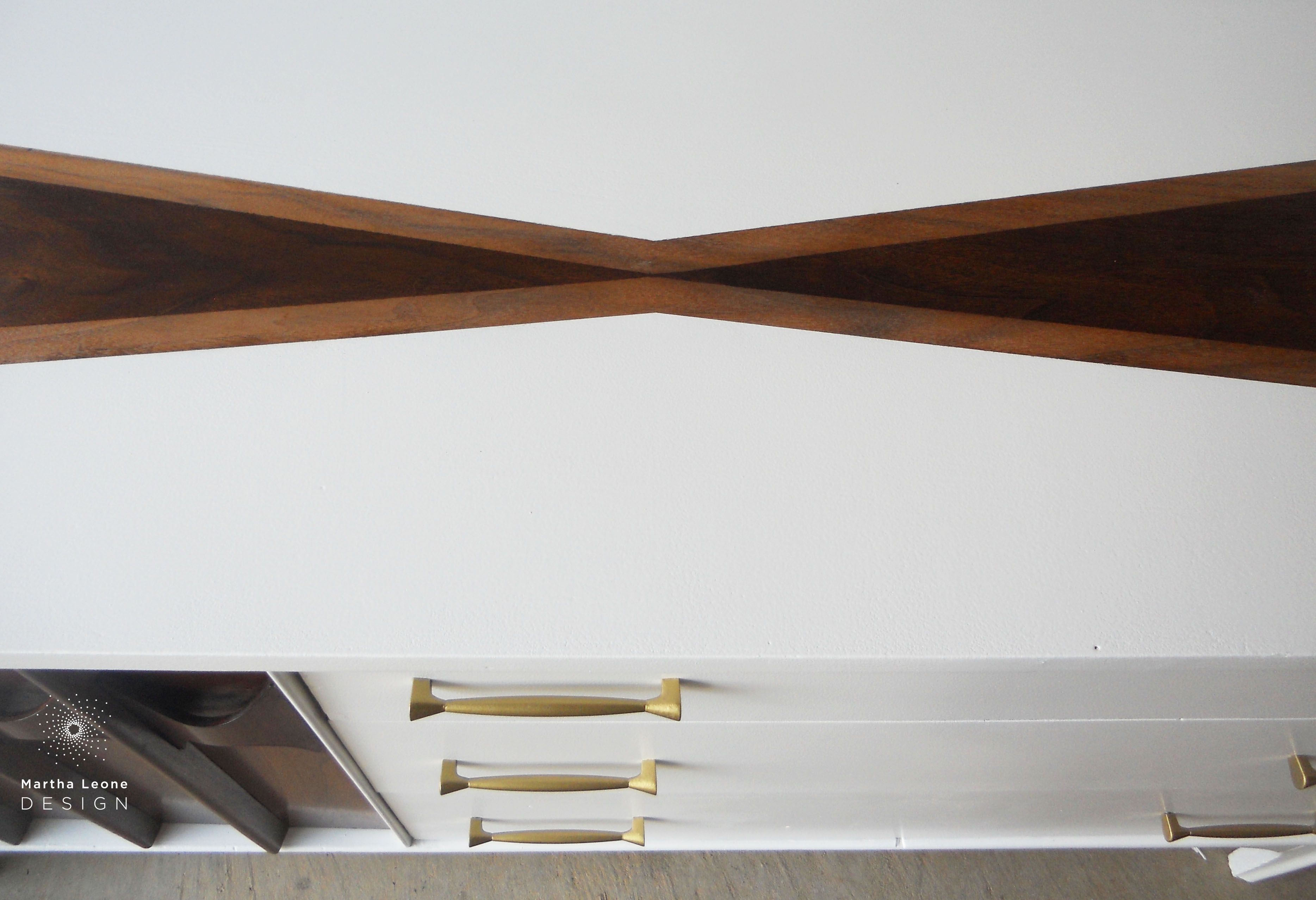
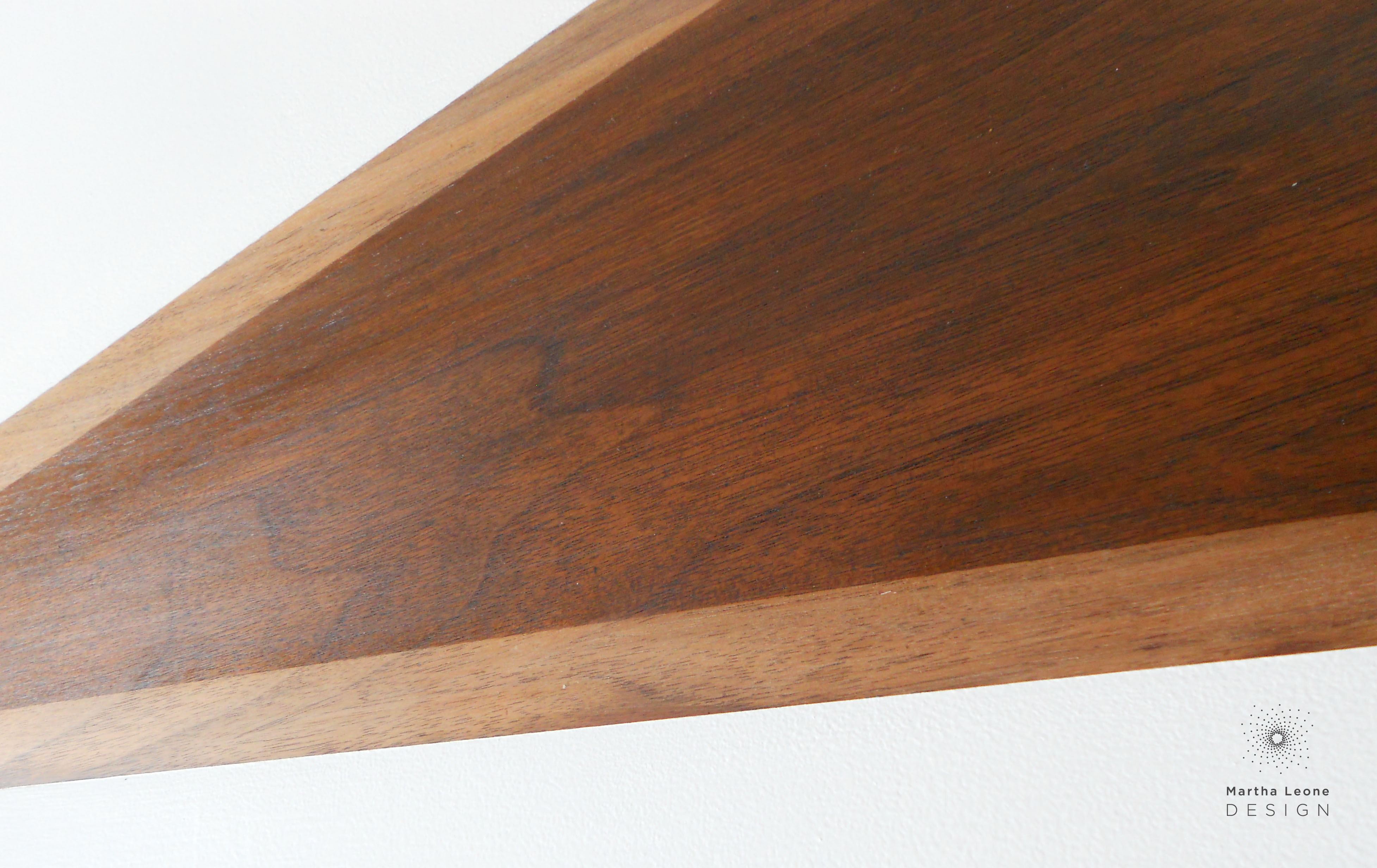
P R O C E S S
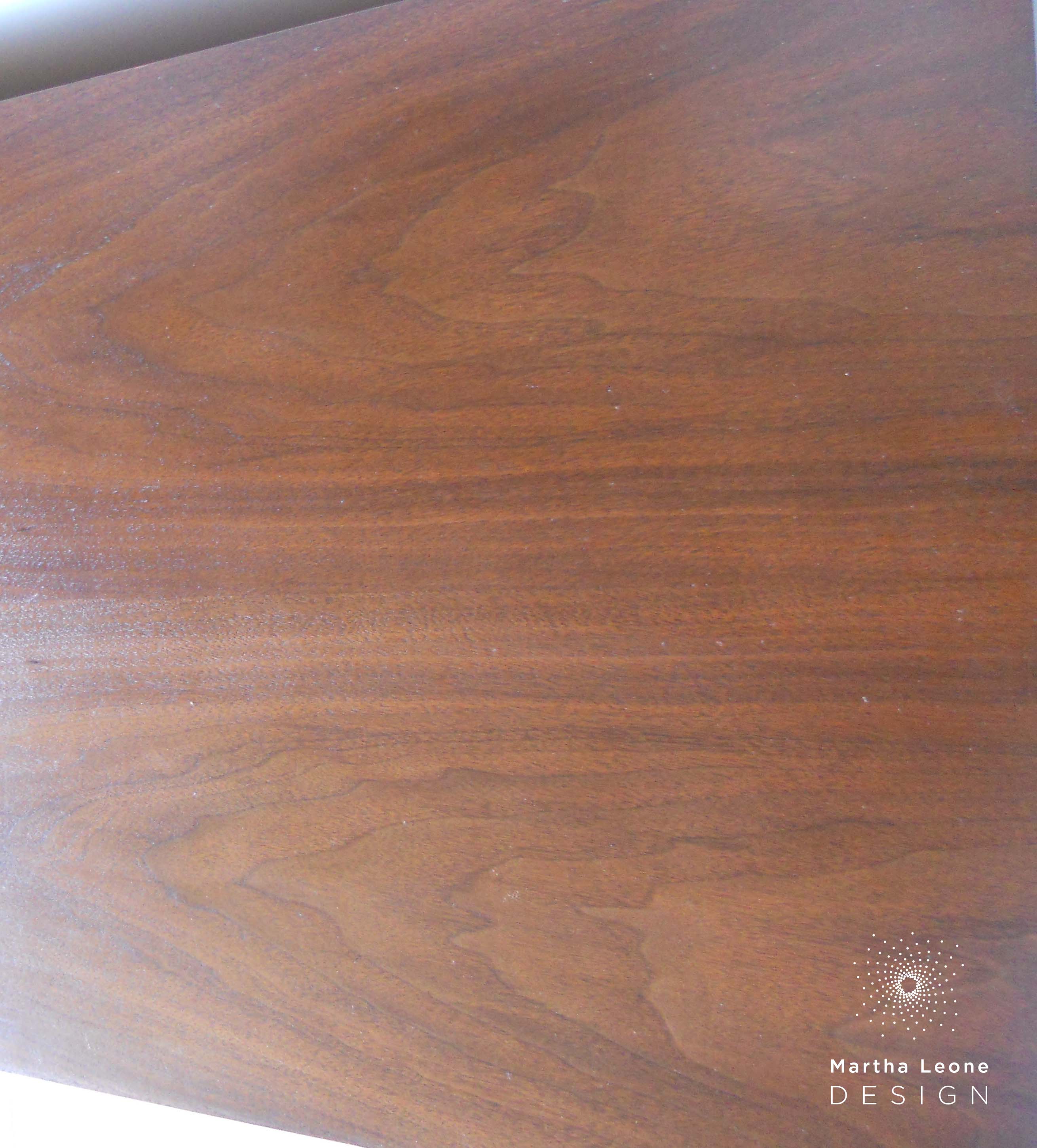
Often times, I'm most interested in showcasing some or all of the beautiful veneers in my mid century pieces. However some of these vintage pieces come to me with damage that can only be repaired and painted. So, the decision to paint or stain is made based on where the damage is. The design on the top of this buffet hides a deep gouge in the surface while still highlighting the beauty of the wood veneer. I used Bondo to fix the damage. It's super easy to use and dries to a very hard finish.
˚˚˚˚˚˚˚˚˚˚˚˚˚˚˚
Follow me on Instagram as I share more pictures of how I paint and prep my furniture and get sneak peeks of my approach to styling these pieces for photoshoots.
