Gray and Brown Credenza
Martha Leone
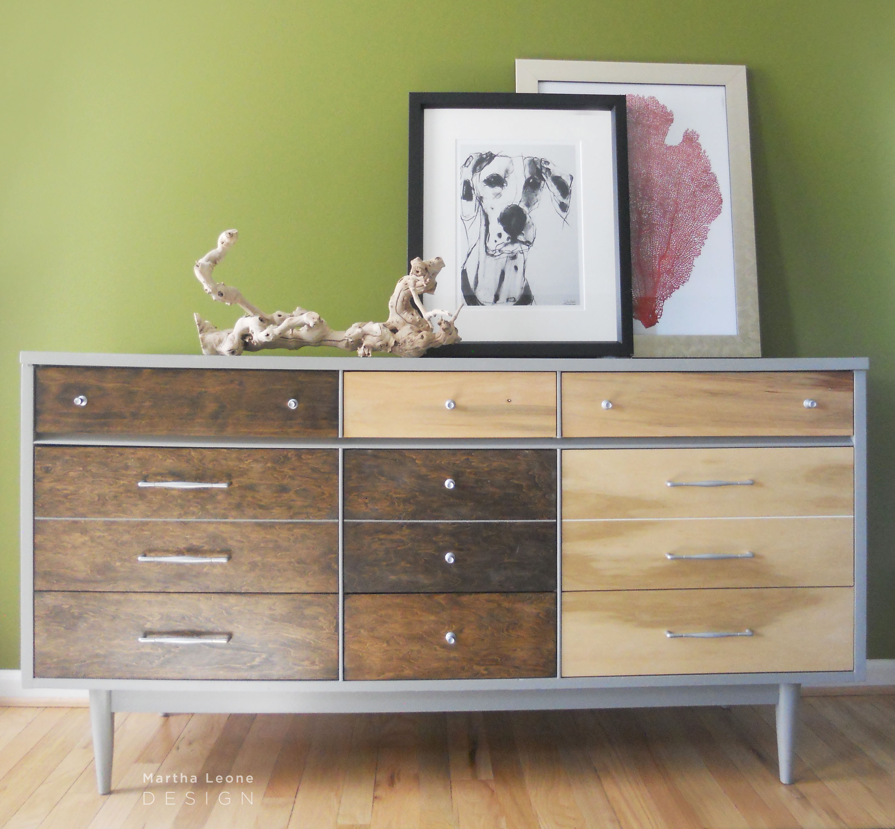
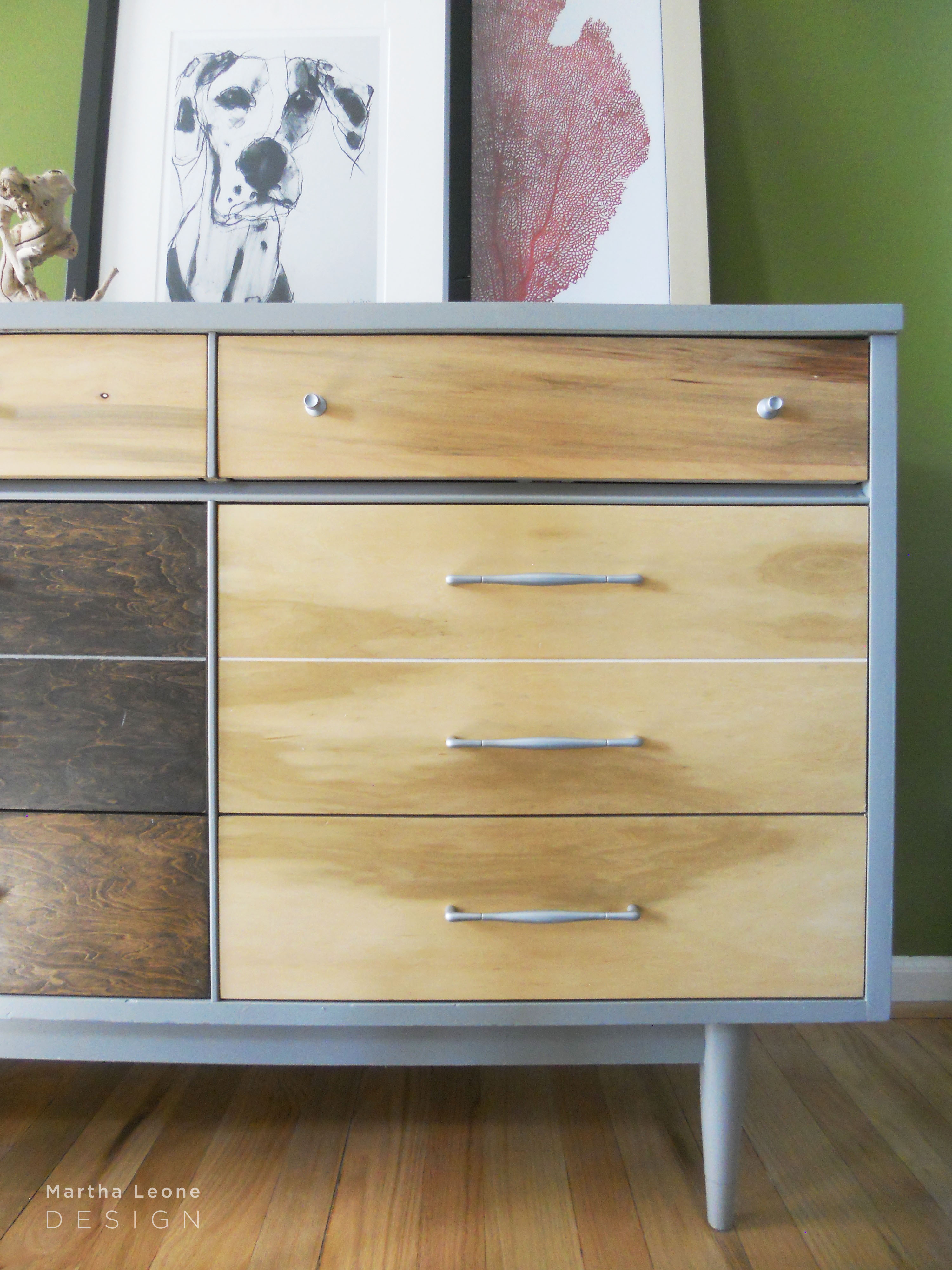
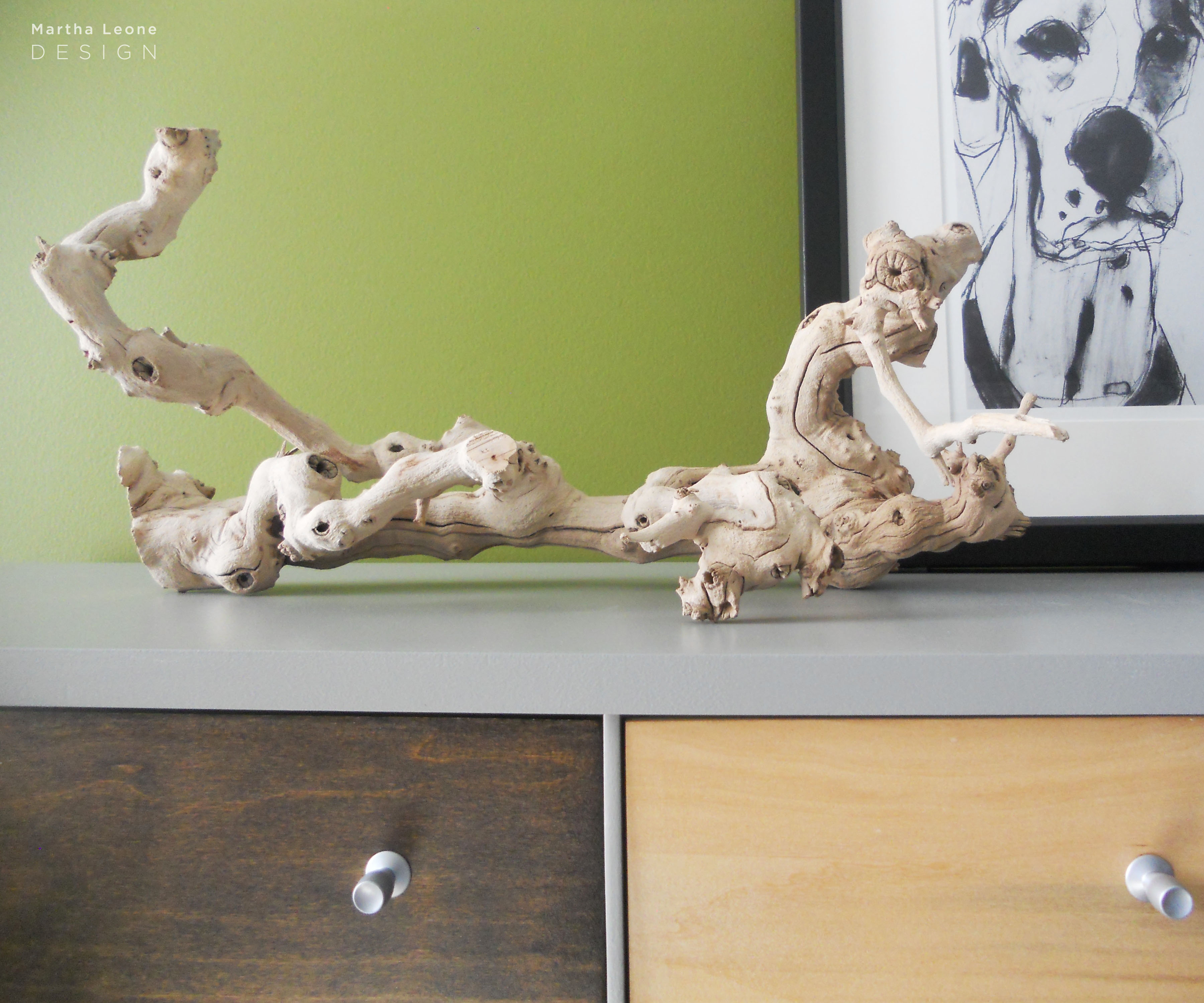 Meet my latest mid-century piece. It sat in my garage for some time as I hesitated to work on it, operating under the wrong assumption that the top was covered with formica (I don't like to paint formica).
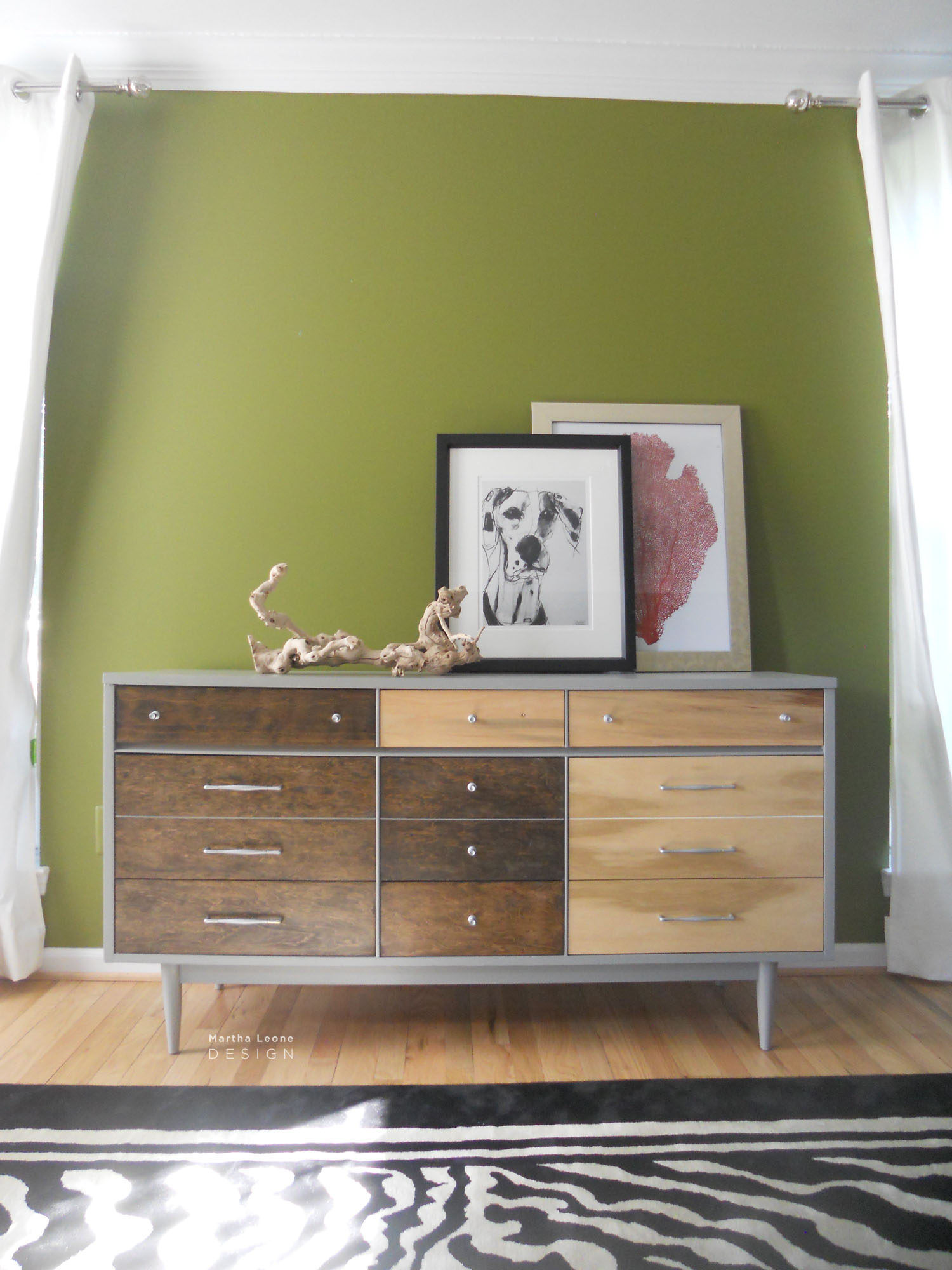
Design Sketchbook in hand, I imagined a fluid asymmetrical design washing across this piece in analogous shades of muted reds and oranges. The plan changed when I sat in front of the piece, staring at its lines. A decision was made. Instead of contrasting its modular design with curvy fluid shapes, I embraced what was already there and simply emphasized the original design with three neutral colors.
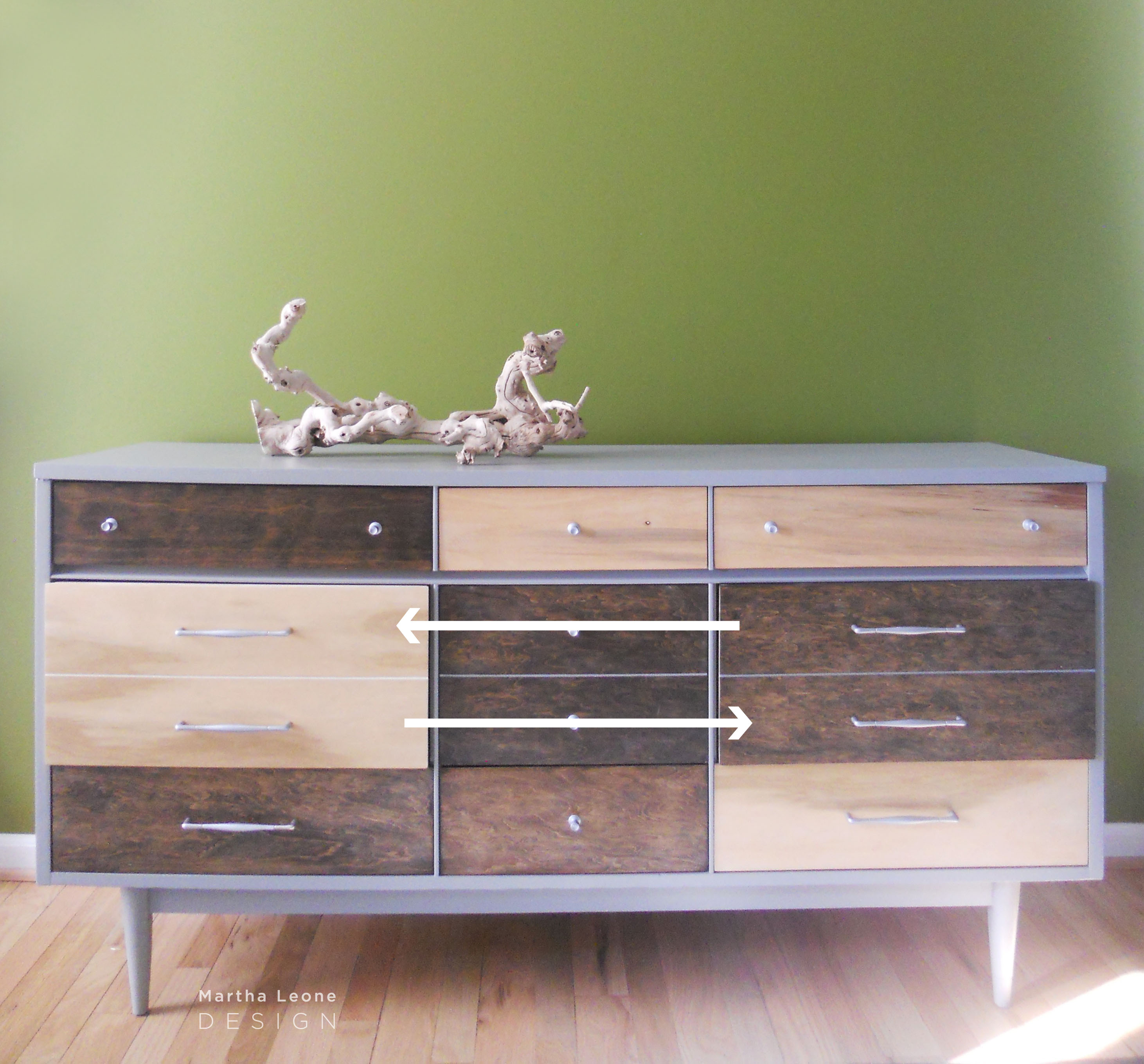
Design revised The original idea was to balance dark and light stain in an asymmetrical design. I numbered the drawers and placed them on the floor for staining. After the piece was completed, I inserted them into the dresser only to find out that the middle left and right drawers were switched by mistake! Here's the design as I intended it with the two drawer switched:
It's important to be flexible and roll with our mistakes so instead of stubbornly holding to my original design (which would have meant sanding both drawers again), I switched the drawers and stepped back to take a look.
Yeah. This was better. Mistakes are good, aren't they?
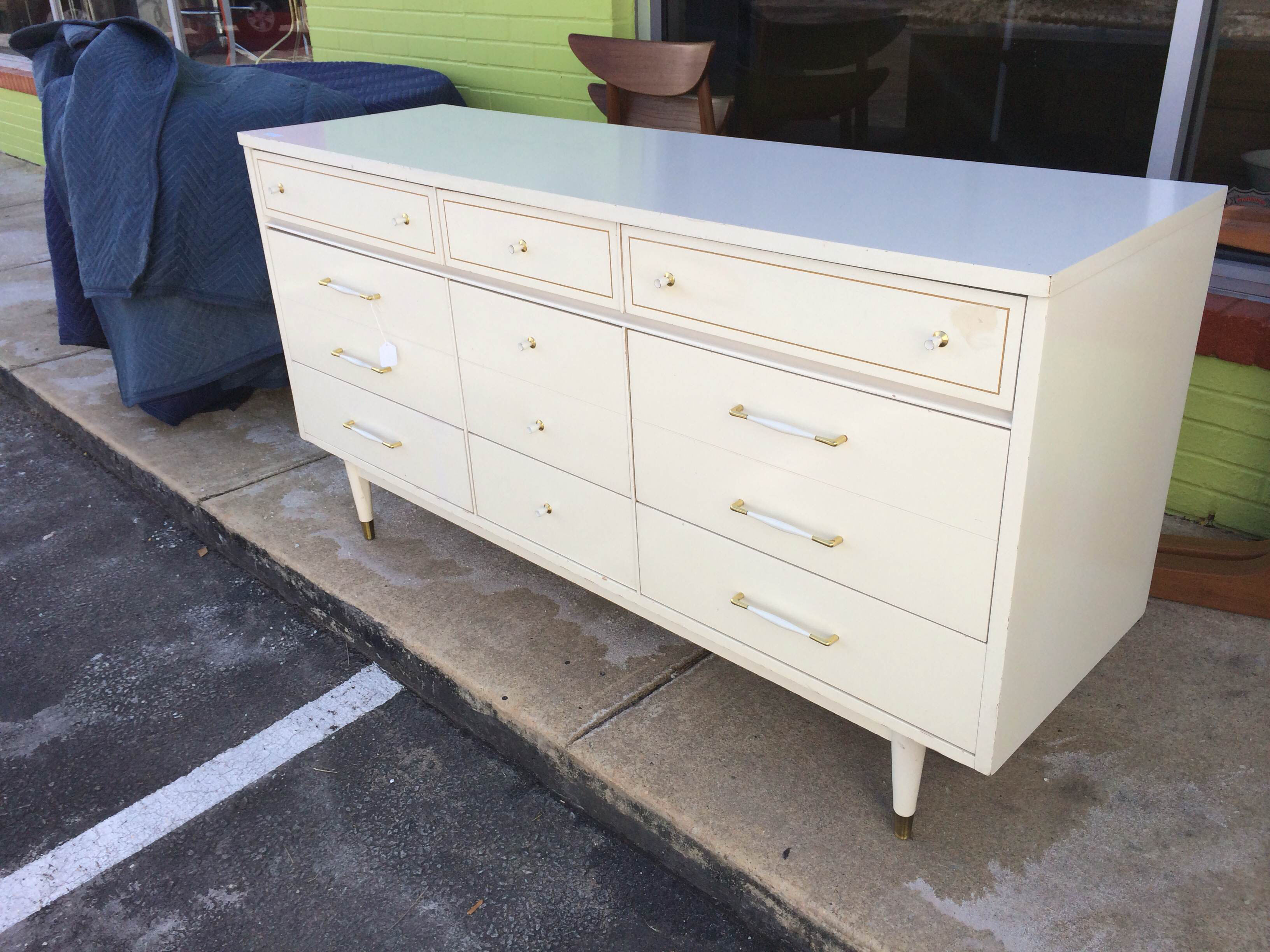
Here's a before shot:
Anyone who shoots their own work probably understands the benefits of apps that help correct lighting and color. I use Adobe Photoshop. Here's a raw photo before it was corrected and cropped.
It's headed to Peg Leg Vintage this weekend and will be available for sale.
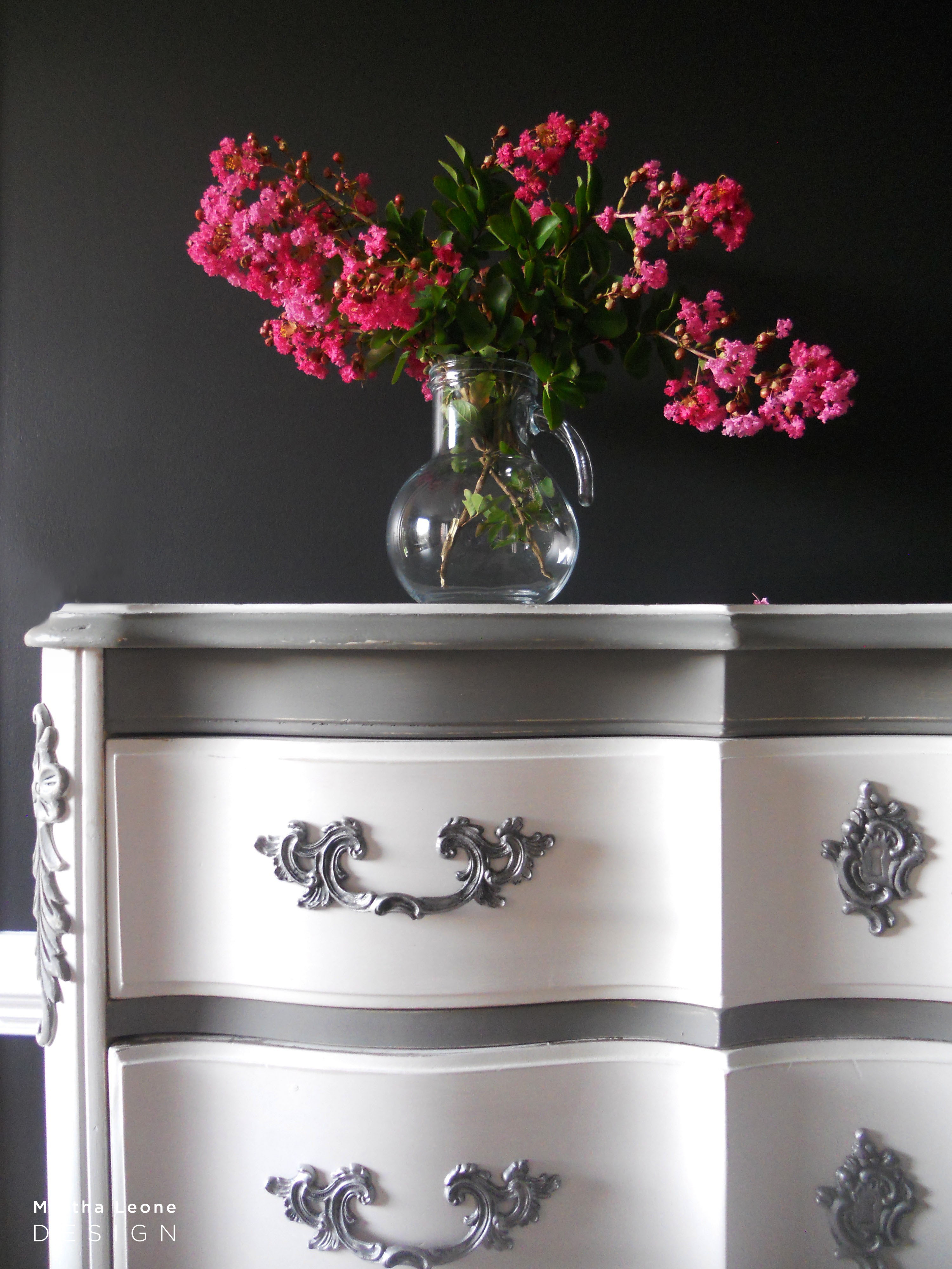
Last week was a favorite work week because I thrive when I'm surrounded by variety and contrasts. While working on this piece I was also working on its opposite: a custom french provencal chest of drawers. Here's a sneak peek of that piece. I'll share more photos next week.
Linking up to these fine parties: Mod Vintage Life • Stone Gable • City Farmhouse/Inspiration Exchange
