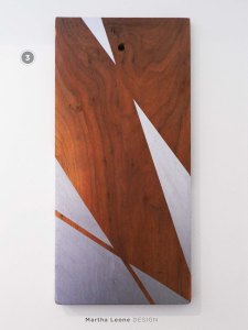
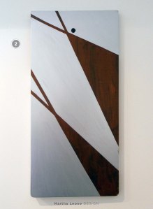
Asymmetry and Transparency
Martha Leone
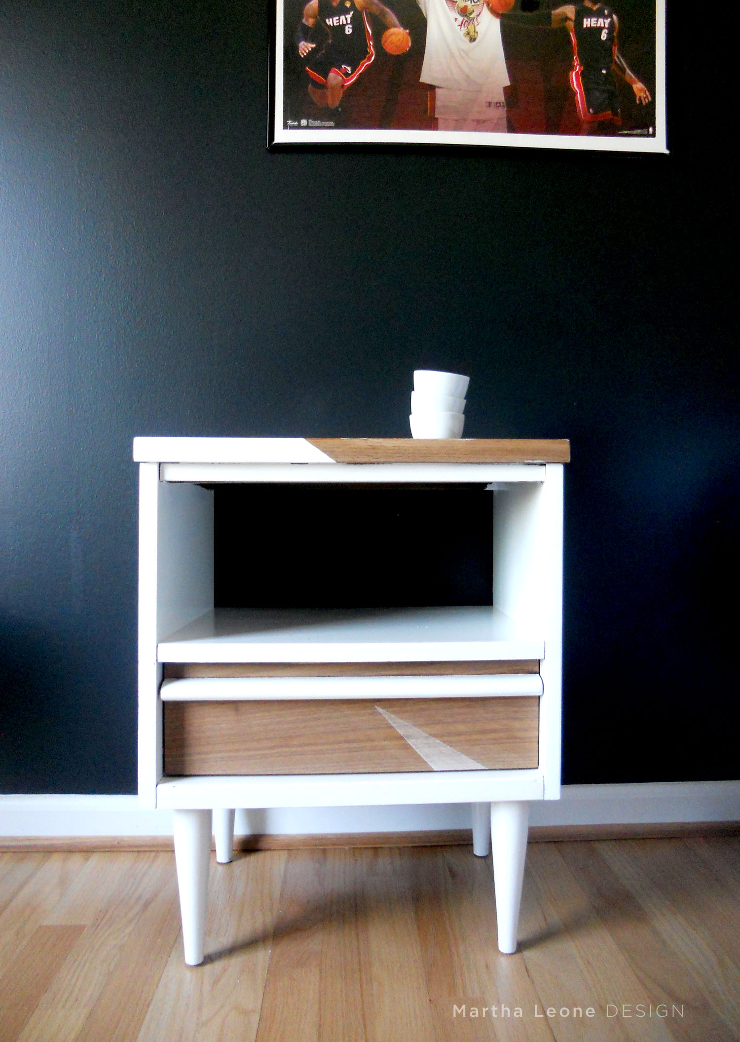
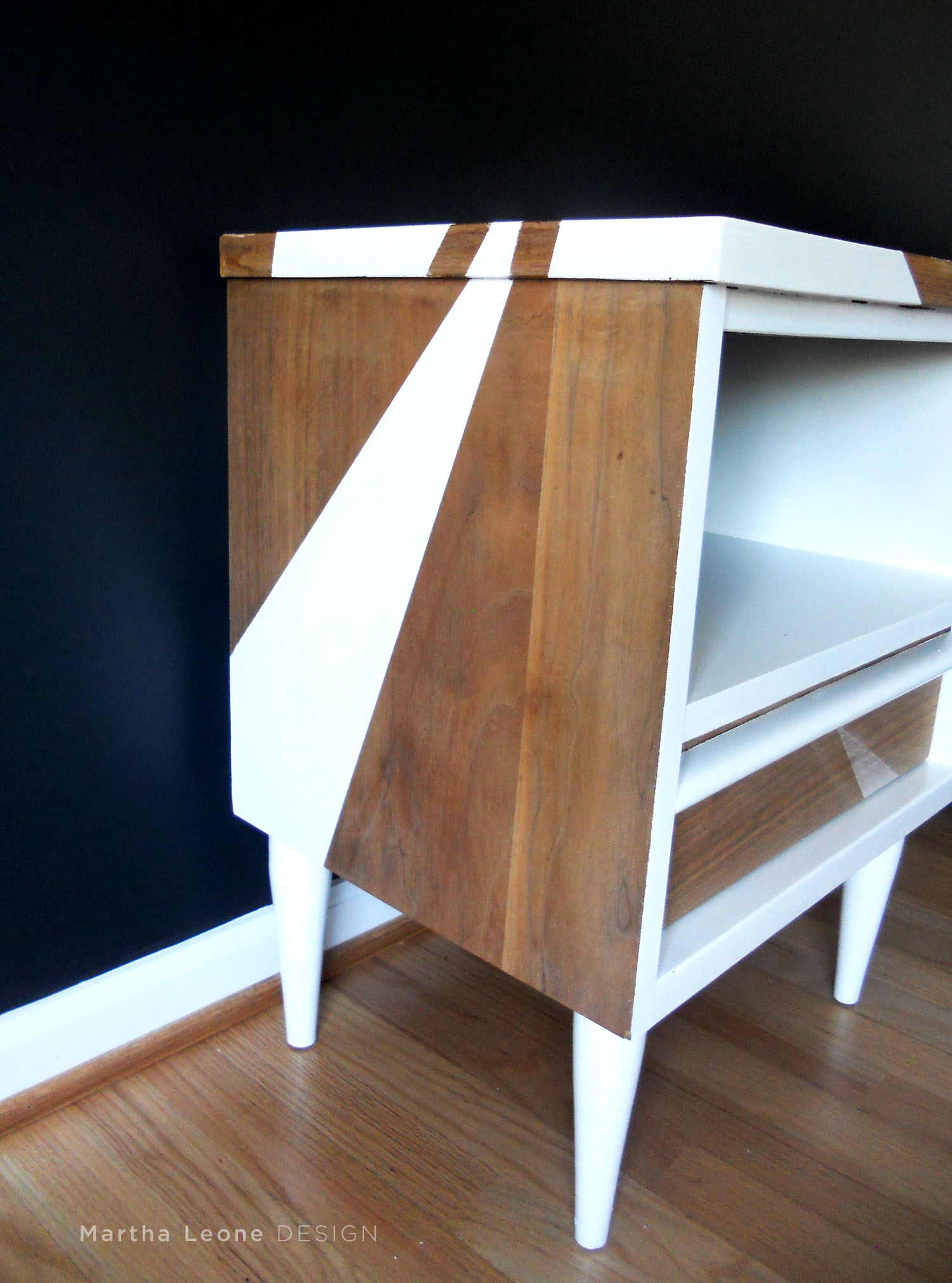
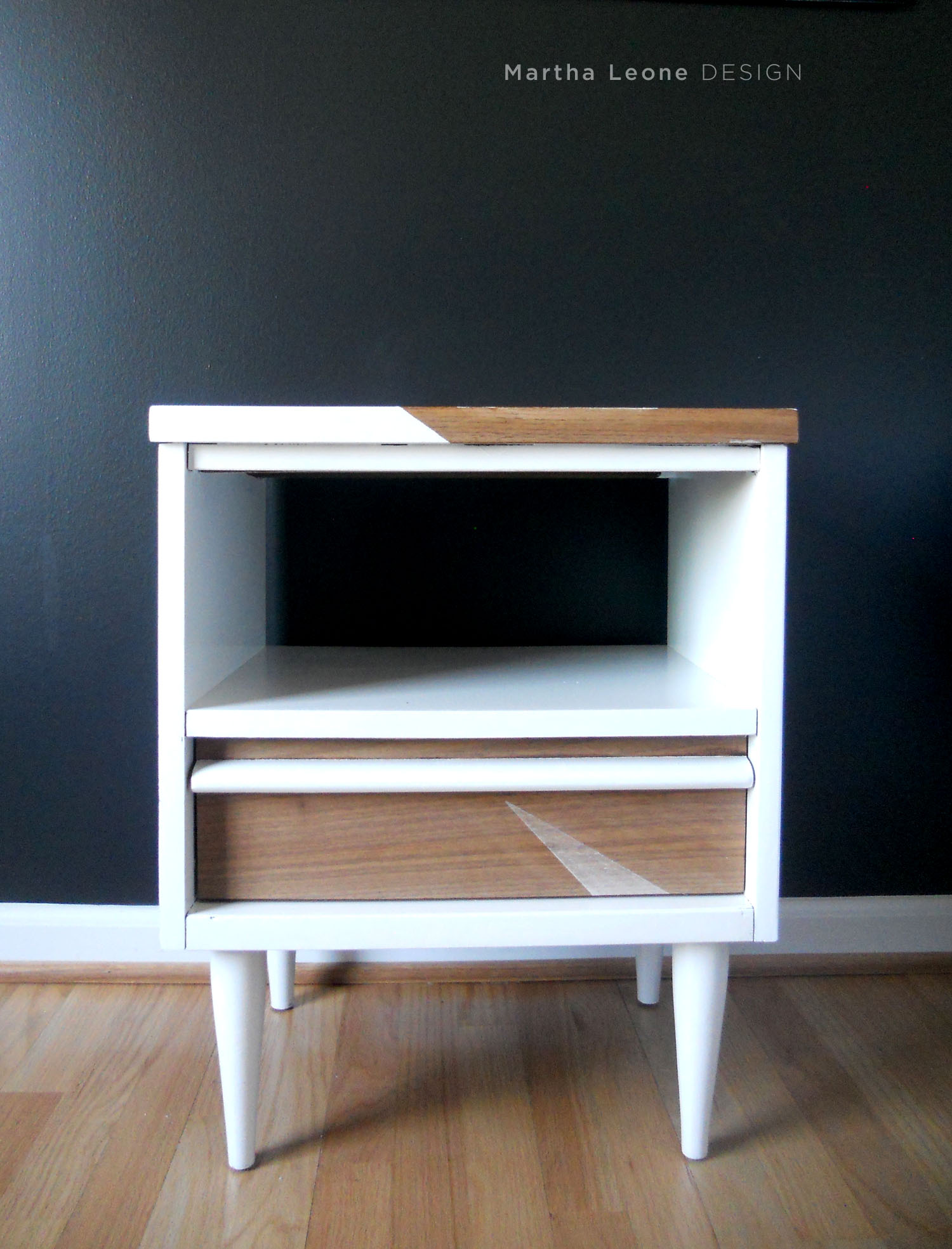
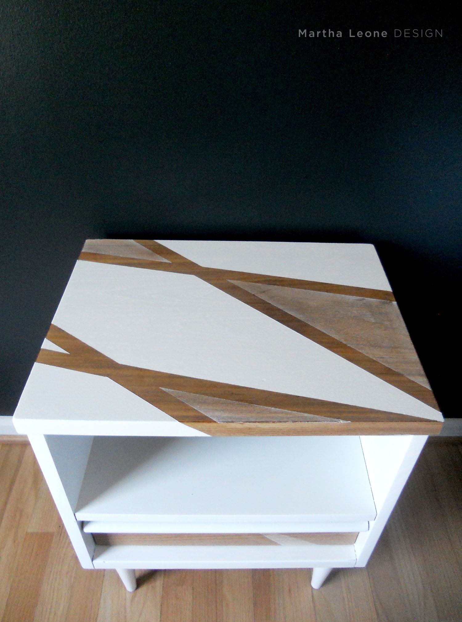
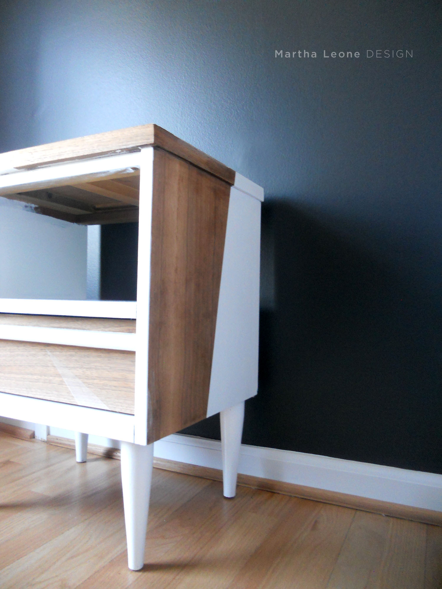
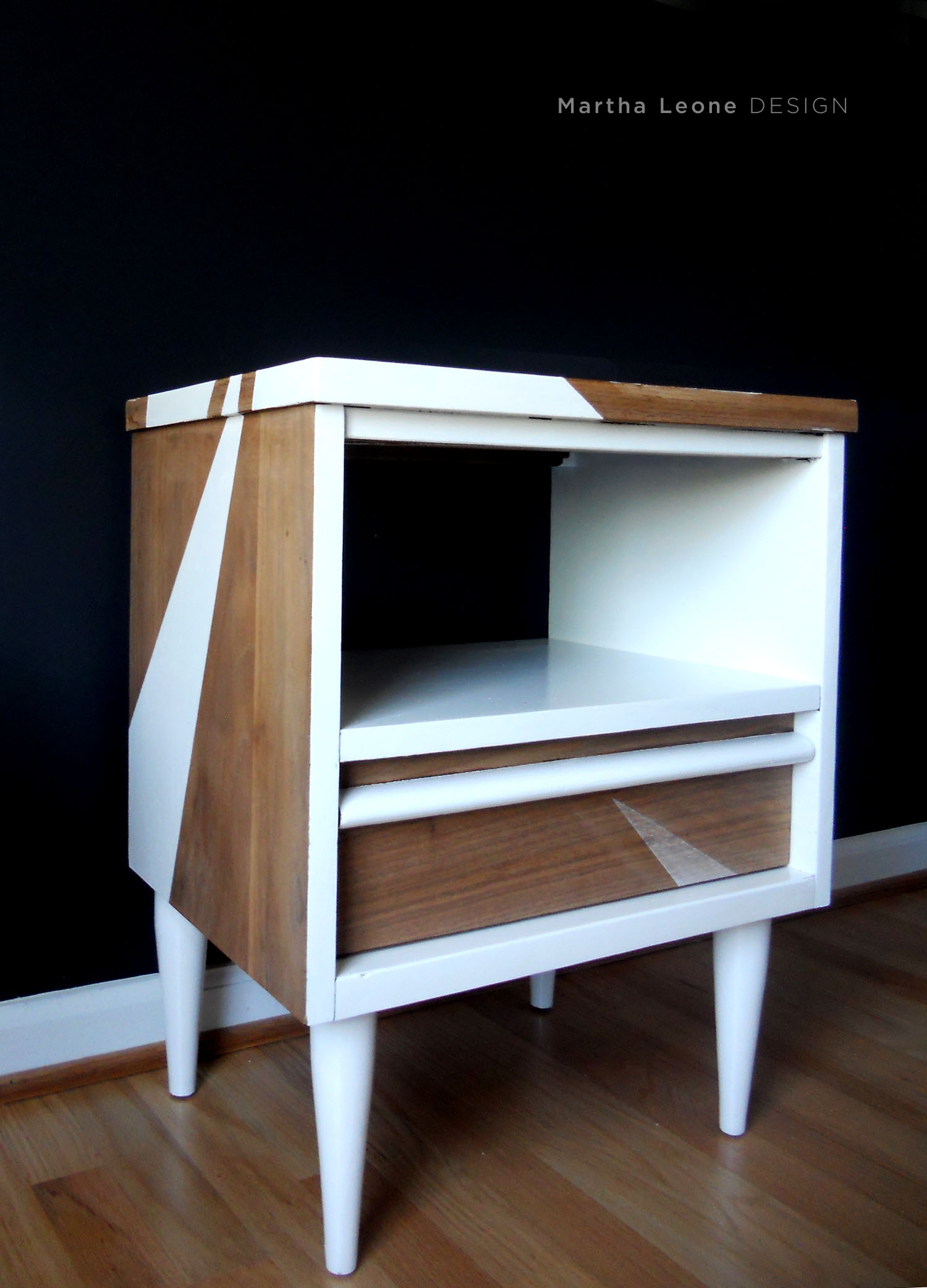
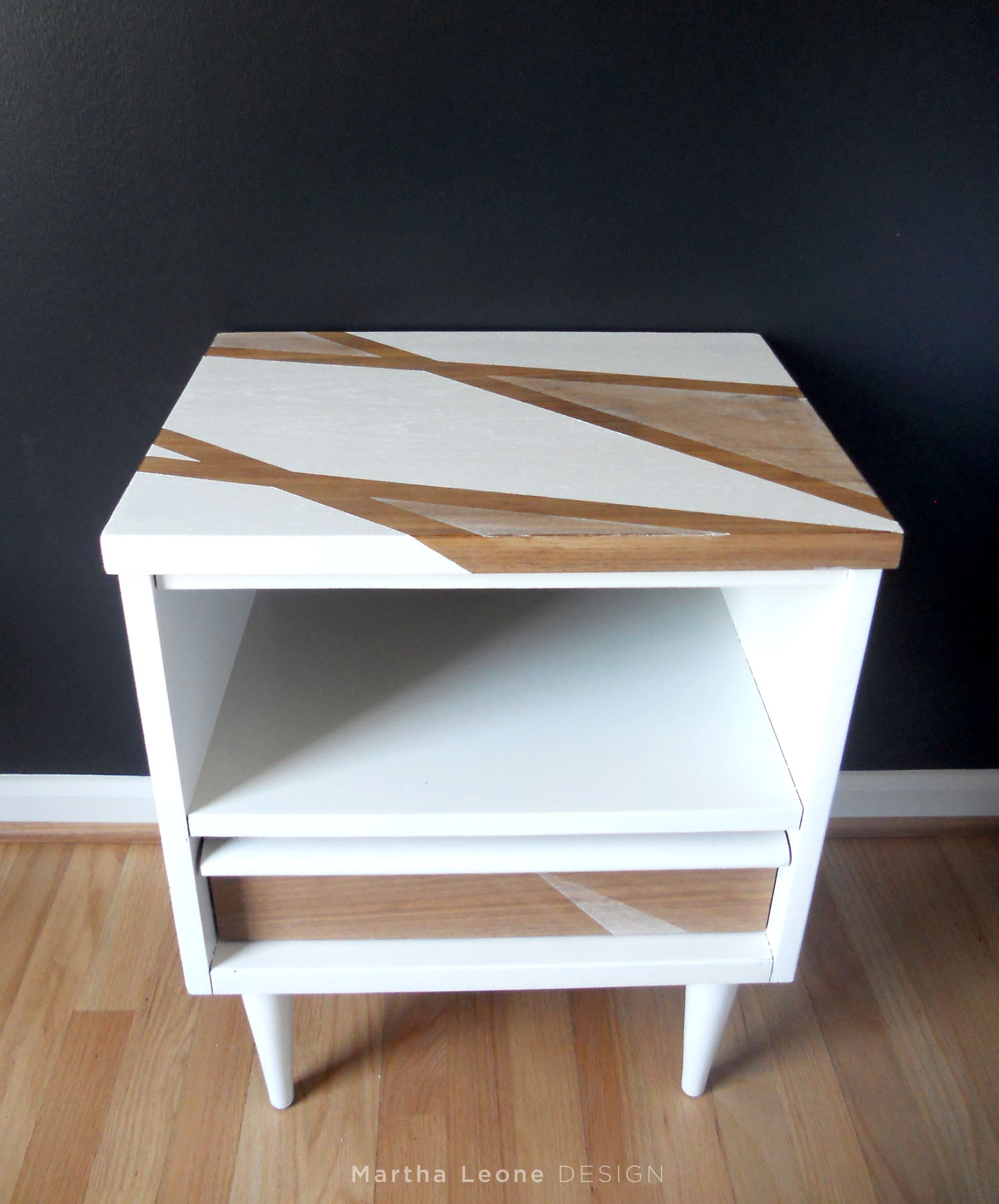
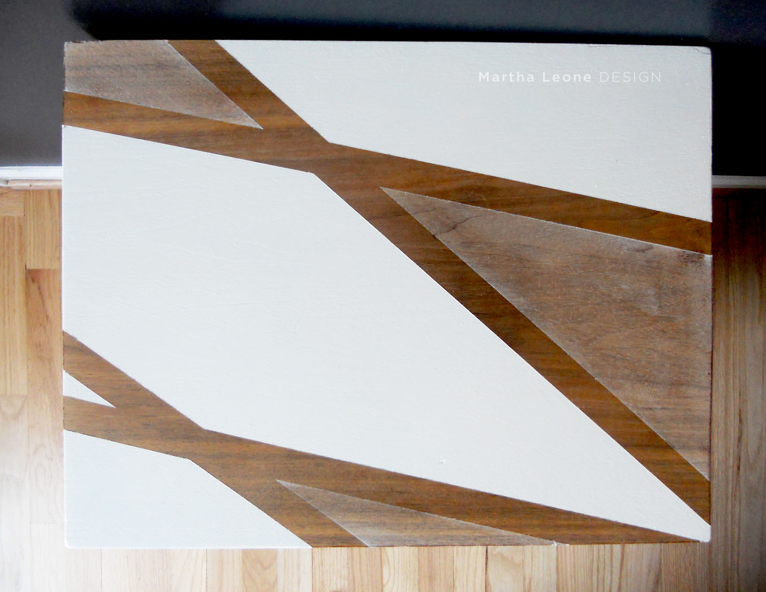 This is one of those tables most people would pass by at a thrift store. It was beat up and ugly to most eyes. But when I saw it, I smiled at its size and long peg legs on such a petite piece. I took it home to practice my technique of masking and painting asymmetrical designs. I'll keep this one... the lines aren't as crisp as they should be.
Design
Exploring these ideas:
- Asymmetry and balance in compositions (design doesn't have to be centered and symmetrical).
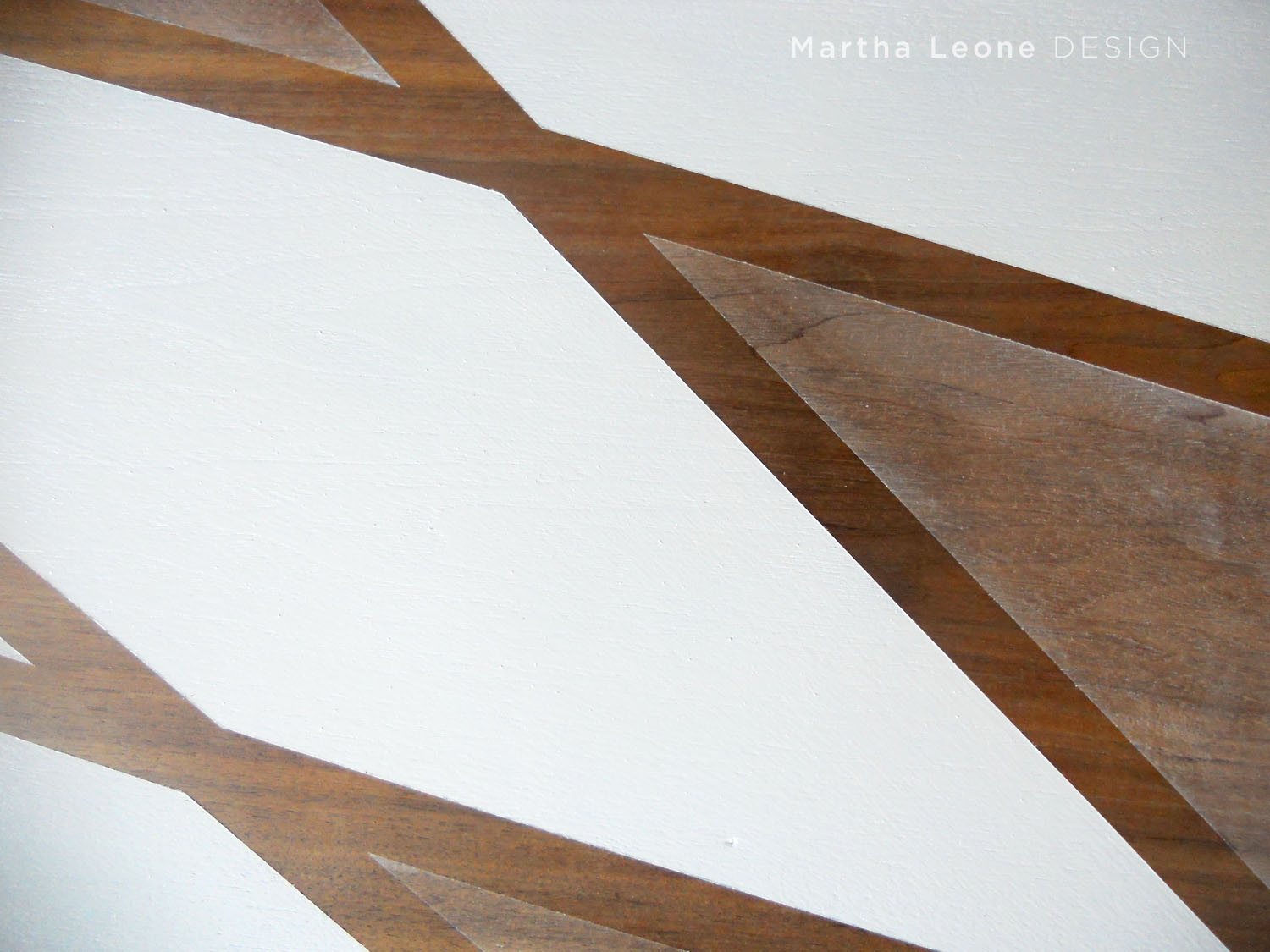
- Transparency and opacity in the use of paint on raw wood.
Process - Sanded the entire piece with an orbital sander. - Masked off design with Frog Tape. - Determined which sections to paint then made the mistake of painting the entire top. - Used Wet Ones to remove paint from the areas that were originally intended to be left unpainted. The wipies did a great job but didn't remove all of the paint. A nice light tint of white remained and I liked it!
Lessons Learned Almost all of my design mistakes become avenues for new ideas and solutions. The mistake on this piece solved another design dilemma I was facing on my next waterfall dresser. More to come on that later.
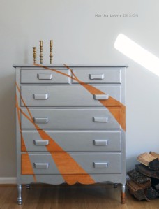
Similar pieces
Linking up to: Finding Silver Pennies • Miss Mustard Seed • Jennifer Rizzo
